 Travis Horn
Creating a Photo Gallery with Vue & CSS Grid

An interactive gallery of photos is the perfect use-case for Vue and the CSS Grid Layout.
This article describes every step along the way to building this photo gallery app.
If you prefer to look the code itself, you can find the repository on GitHub: travishorn/photo-gallery.
Prerequisites
To follow along, you’ll need Node.js and version 3 of the Vue CLI.
To install Node.js, go to the homepage and find your download.
Once Node.js is installed, open a terminal and install the Vue CLI.
npm install -g @vue/cliSetup
In a terminal, create a new app with the Vue CLI. This will create a new directory in the current directory.
vue create photo-galleryIt will ask you to pick a preset. Choose Manually select features.
Vue CLI v3.4.1
? Please pick a preset: (Use arrow keys)
  default (babel, eslint)
> Manually select features
Arrow down to Router and press Space to select it.
? Check the features needed for your project:
 (*) Babel
 ( ) TypeScript
 ( ) Progressive Web App (PWA) Support
>(*) Router
 ( ) Vuex
 ( ) CSS Pre-processors
 (*) Linter / Formatter
 ( ) Unit Testing
 ( ) E2E Testing
You can leave all other options as they are and press Enter.
For the rest of the options, feel free to accept the defaults by pressing
Enter at each prompt.
When the CLI finishes, you’ll have a new directory called photo-gallery which
contains a sample Vue app.
Serve the app.
cd photo-gallery
npm run serve
The sample app will be available at http://localhost:8080/.

Keep the development server running as we develop the app. It will automatically reload as we update components.
The Data
A photo gallery contains photos and information about those photos. You can use your own, or download the sample photos I used.
Create a new directory under src/ called images/. Place all the photo image
files in this directory.
Inside src/images/ create another directory called thumbnails/. This
directory should contains image files with the exact same name as the original
photo files. The images in this directory should be scaled down and compressed
versions of the same photos.
For best results, I sized all of these thumbnail images to exactly 600 x 600 pixels.
Finally, inside the src/ directory, create a file called photos.json. This
will be our “database” of photos. It should contain all the information about
each photo.
Here is a sample of the structure of this file. If you’re using my sample photos, you can download the JSON file.
[
{
"id": 0,
"title": null,
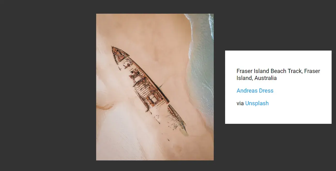
"filename": "andreas-dress-1406323-unsplash.jpg",
"location": "Fraser Island Beach",
"source": {
"name": "Unsplash",
"url": "https://unsplash.com"
},
"photographer": {
"name": "Andreas Dress",
"url": "https://unsplash.com/@picsbydress"
}
},
{
"id": 1,
"title": null
// ... snip ...
}
// ... snip ...
]At this point, we have scaffolded a Vue app and added some photo data. The file structure looks something like this. Note that I’m only including the most relevant files and directories here so you can get an idea of where everything important should be.
node_modules/
public/
src/
  assets/
    images/
      andreas-dress-1406323-unsplash.jpg
      ... a bunch of other image files ...
    thumbnails/
      andreas-dress-1406323-unsplash.jpg
      ... a bunch of other thumbnails ...
  components/
  views/
  App.vue
  main.js
  photos.json
  router.js
.browserslistrc
.eslintrc.js
.gitignore
... a bunch of other project files ...
Grid-based Gallery
Let’s start by modifying App.vue. This is the root component everything else
will go into. We can remove basically everything in it and replace it with the
following.
<template>
  <router-view />
</template>

<style>
@import url("https://fonts.googleapis.com/css?family=Roboto");

html {
  font-size: 22px;
}
body {
  font-family: "Roboto", sans-serif;
}

a {
  color: #0094ff;
  text-decoration: none;
}

a:hover {
  color: #0074c6;
}
</style>
There’s nothing too crazy going here. The template simply contains the router’s view and nothing else. Then there’s some basic font and color styles.
By default, the router points to the Home view. This view is defined in
src/views/Home.vue. Let’s edit that now.
This is another simple one. Replace everything in the file with the following.
<template>
  <Gallery />
</template>

<script>
import Gallery from "@/components/Gallery.vue";

export default {
  name: "home",
  components: {
    Gallery,
  },
};
</script>
This view is simply showing the Gallery component. This component doesn’t
exist, yet. Let’s create it.
Create src/components/Gallery.vue. Here’s the first big chunk of our app.
The template looks like this:
<template>
  <div class="gallery">
    <div class="gallery-panel" v-for="photo in photos" :key="photo.id">
      <img :src="thumbUrl(photo.filename)" />
    </div>
  </div>
</template>
Inside the main div, we’re using a v-for to loop over a photos property
and create divs for each one.
Each of these divs contains an image.
Each image’s src is set by a function we’ll define next.
Now for the script.
<script>
import photos from "@/photos.json";

export default {
  name: "Gallery",
  data() {
    return {
      photos,
    };
  },
  methods: {
    thumbUrl(filename) {
      return require(`../assets/images/thumbnails/${filename}`);
    },
  },
};
</script>
In this file, we import the “database” JSON file from earlier.
We use this JSON data to set the photos property in the data object. This
property is an array of photo data that our template loops over to create divs
for each photo.
In the methods area, we’re defining the thumbUrl() function we use in the
template. The template passes the photo’s filename to this function and it
returns the URL to the photo’s thumbnail.
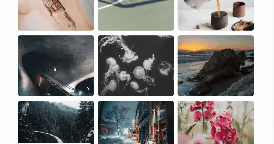
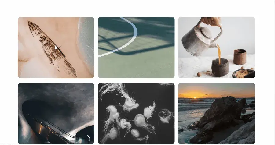
At this point, the images are displayed on the page.
Some styling will go a long way here.
<style>
.gallery {
  display: grid;
  grid-template-columns: repeat(auto-fill, minmax(20rem, 1fr));
  grid-gap: 1rem;
  max-width: 80rem;
  margin: 5rem auto;
  padding: 0 5rem;
}

.gallery-panel img {
  width: 100%;
  height: 22vw;
  object-fit: cover;
  border-radius: 0.75rem;
}
</style>
On our container .gallery we set display: grid and set the
grid-template-columns. With this style, columns are automatically adjusted
based on the number of photos and the size of the viewport.
Photos will be displayed in a grid and automatically resize. If the photos get
to below 20rem (about 440px in our case), a column gets dropped to allow the
photos to stay above 20rem.
Lightbox
It’s looking great so far. Now we want users to be able to click on a photo and see the full image front-and-center.
For that, we’ll wrap each image with a link. Since we’re using Vue Router, we’ll
use router-link instead of an a tag.
Update the template.
<template>
  <div class="gallery">
    <div class="gallery-panel" v-for="photo in photos" :key="photo.id">
      <router-link :to="`/photo/${photo.id}`">
        <img :src="thumbUrl(photo.filename)" />
      </router-link>
    </div>
  </div>
</template>
The link has a dynamic to attribute which points it to /photo/${photo.id}.
For example, the first image — which has an id of 0— will link to
/photo/0.
We need to set up that route. Open src/router.js.
Delete the sample /about route so the entire router looks like this.
import Vue from "vue";
import Router from "vue-router";
import Home from "./views/Home.vue";

Vue.use(Router);

export default new Router({
  mode: "history",
  base: process.env.BASE_URL,
  routes: [
    {
      path: "/",
      name: "home",
      component: Home,
    },
  ],
});
At the top, import a photo component which we’ll build in a moment. Then, add a route that uses it.
import Vue from 'vue';
import Router from 'vue-router';
import Home from './views/Home.vue';
**import Photo from './views/Photo.vue';**

Vue.use(Router);

export default new Router({
  mode: 'history',
  base: process.env.BASE_URL,
  routes: [
    {
      path: '/',
      name: 'home',
      component: Home,
    },
    {
      path: '/photo/:id',
      name: 'photo',
      component: Photo,
    },
  ],
});
We can now build the view for this route. Create src/views/Photo.vue.
<template>
  <Photo />
</template>

<script>
import Photo from "@/components/Photo.vue";

export default {
  name: "photo",
  components: {
    Photo,
  },
};
</script>
This is another simple file. The template is just showing one component, which we import in the script. Normally, we would just leave this file out and wire our route directly to the component, but we’ll need to modify this view later to add a feature, so it’s important.
The Photo view is importing a Photo component. Create
src/components/Photo.vue. This is the last big chunk of the app.
Let’s start with a simple template.
<template>
  <div class="lightbox">
    <img :src="photoUrl(photo.filename)" />

    <div class="lightbox-info">
      <div class="lightbox-info-inner">Info</div>
    </div>
  </div>
</template>
The .lightbox div is like the container for the image and the info we’ll
display next to it.
The img tag actually displays the image. It’s src attribute uses another
function we’ll code up in the script.
Immediately after the img there’s a div which will contain information about
the photo. You may also notice an inner div which will be used for styling.
Now for the script.
<script>
import photos from "@/photos.json";

export default {
  name: "Photo",
  data() {
    return {
      photos,
    };
  },
  computed: {
    photo() {
      return this.photos.find((photo) => {
        return photo.id === Number(this.$route.params.id);
      });
    },
  },
  methods: {
    photoUrl(filename) {
      return require(`../assets/images/${filename}`);
    },
  },
};
</script>
Here again, we’re importing photos.json to get the photo data.
But this time we’re using a computed property which find the photo with the id
specified in the URL.
Finally, there’s the photoUrl() function which returns an image URL based on a
filename. This time, instead of the thumbnail, it provides the URL to the full
resolution image.
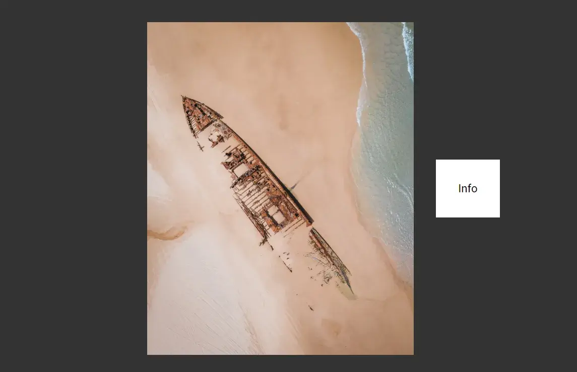
Going back to the running app… click on an image and you’ll be brought to the photo view. So far, the component displays the image and a small bit of text that just says “info”.
The photo is way too big and the info text is pushed off the page. We need some styling.
<style>
.lightbox {
  position: fixed;
  top: 0;
  left: 0;
  width: 100%;
  height: 100%;
  background-color: rgba(0, 0, 0, 0.8);
  display: grid;
  grid-template-columns: repeat(3, 1fr);
  grid-gap: 2rem;
}

.lightbox img {
  margin: auto;
  width: 100%;
  grid-column-start: 2;
}

.lightbox-info {
  margin: auto 2rem auto 0;
}

.lightbox-info-inner {
  background-color: #ffffff;
  display: inline-block;
  padding: 2rem;
}
</style>
For the container .lightbox we fix it so that it takes up the entire viewport.
It also has a semi-transparent dark background color. Perhaps most importantly,
it uses display: grid with 3 equal width columns.
The .lightbox-img has automatic margins, putting it in the center of it’s
column. The width is 100% so it always takes up the whole column (and only the
column — no overflow), and it has grid-column-start: 2 so that it starts in
the second column of our 3-column grid. This puts it in the center.
.lightbox-info has a margin of auto 2rem auto 0 meaning that the top and
bottom margins are set automatically, centering it vertically in it’s column.
The right margin is set to 2rem so it’s pushed away from the right edge of the
screen. The left margin is set to 0 because there will already be space there
from the grid-gap we set on the container element.
Finally, .ligthbox-info-inner uses a light background with a little bit of
padding. That’s where our photo info will go.
These styles make everything look like a lightbox.
Right now, there’s just placeholder text in the info box. Replace the word “info” with this template HTML.
<p v-if="photo.title">{{ photo.title }}</p>

<p v-if="photo.location">{{ photo.location }}</p>

<p v-if="photo.photographer">
  <a rel="nofollow" :href="photo.photographer.url">
    {{ photo.photographer.name }}
  </a>
</p>

<p v-if="photo.source">
  via
  <a rel="nofollow" :href="photo.source.url"> {{ photo.source.name }} </a>
</p>
If there’s a photo title, show it.
If there’s a photo location, show it.
If there’s a photographer, display their name with a link to their URL.
If there’s a source, display its name with its URL.
Things are starting to come together. There’s a few features that will really complete the app, though.
For one, we want to close the lightbox and go back to the gallery whenever someone clicks on the dark background. This is as simple as adding a click event that pushes a route to the router.
In the template, add a click event to the lightbox element.
<div class="lightbox" @click.self="closeLightbox"></div>Notice I used the .self modifier. Without it, the click event will propagate
to sub-elements and the lightbox would close even if you clicked on the photo or
info.
This click event is firing a function called closeLightbox. Create that
function in the methods property.
closeLightbox() {
  this.$router.push('/');
}
Basically, we just redirect the client back to the homepage, which is the gallery of images.
One feature that would make this look better is if the gallery stayed in the background when the lightbox was shown.
It turns out, this is pretty easy. Open src/views/Photo.vue.
Right now, the template contains a single element: a reference to the Photo
component. We want to show the gallery on this page, too.
To add the gallery, add its tag.
<template>
  <Gallery />
  <Photo />
</template>
Since Vue components must have a single root element, add a parent div.
<template>
  <div>
    <Gallery />
    <Photo />
  </div>
</template>
Then, in the script, import the Gallery component.
<script>
import Gallery from "@/components/Gallery.vue";
import Photo from "@/components/Photo.vue";

export default {
  name: "photo",
  components: {
    Gallery,
    Photo,
  },
};
</script>
Done! When you click on a photo, the lightbox opens, but the gallery stays in the background. Clicking the dark area around the lightboxed photo (or clicking the back button) returns you to the gallery.
The URL always reflects the currently open image. If you send someone a URL to a lightboxed photo, it will work as expected: the photo loads in a lightbox with the gallery in the background. Clicking takes them to the gallery itself.
Cleanup
There are some files the Vue CLI created that we don’t need anymore. You can safely delete…
src/views/About.vuesrc/components/HelloWorld.vuesrc/assets/logo.webp
You should also consider updating README.md to be more descriptive of the
actual app we’ve created.
Code for this entire project can be found on GitHub: travishorn/photo-gallery.