


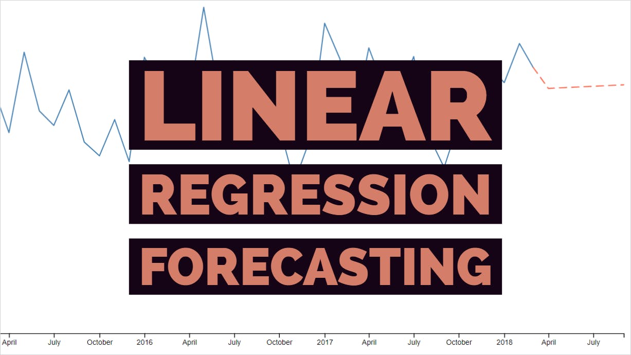
In this post, we’ll build a function for predicting data using linear regression and the least-squares method. Then we’ll plot the forecasted data on a line chart using JavaScript and D3 — Data Driven Documents.
Setup
Start with a basic HTML page — index.html— that references D3 and a main JavaScript file we’ll write in a minute.
<!doctype html>
<html lang="en">
  <head>
    <meta charset="utf-8">
    <meta name="viewport" content="width=device-width, initial-scale=1, shrink-to-fit=no">

    <title>My Chart</title>
  </head>
  <body>
    <script src="https://d3js.org/d3.v5.min.js"></script>
    <script src="scripts/main.js">
  </body>
</html>
All of the rest of the work on this project will be done in scripts/main.js.
Formatting and calculating the data
Let’s start with a set of data. The Hass Avocado Board provides retail volume and prices for avocados in the United States. I downloaded this data and summarized it by month. What you see below is the total avocados sold in the US by month from January 2015 to March 2018.
let history = [
  { date: '2015-01-01', volume: 120453518 },
  { date: '2015-02-01', volume: 137503440 },
  { date: '2015-03-01', volume: 158757311 },
  { date: '2015-04-01', volume: 130552492 },
  { date: '2015-05-01', volume: 182752154 },
  { date: '2015-06-01', volume: 144304088 },
  { date: '2015-07-01', volume: 135088854 },
  { date: '2015-08-01', volume: 158191824 },
  { date: '2015-09-01', volume: 124257823 },
  { date: '2015-10-01', volume: 115231050 },
  { date: '2015-11-01', volume: 138719625 },
  { date: '2015-12-01', volume: 111443042 },
  { date: '2016-01-01', volume: 179118249 },
  { date: '2016-02-01', volume: 161566818 },
  { date: '2016-03-01', volume: 147686869 },
  { date: '2016-04-01', volume: 151936061 },
  { date: '2016-05-01', volume: 211814173 },
  { date: '2016-06-01', volume: 154985479 },
  { date: '2016-07-01', volume: 176758565 },
  { date: '2016-08-01', volume: 139879341 },
  { date: '2016-09-01', volume: 136744721 },
  { date: '2016-10-01', volume: 135775521 },
  { date: '2016-11-01', volume:  97906206 },
  { date: '2016-12-01', volume: 124987140 },
  { date: '2017-01-01', volume: 201461887 },
  { date: '2017-02-01', volume: 178173517 },
  { date: '2017-03-01', volume: 135677135 },
  { date: '2017-04-01', volume: 185292137 },
  { date: '2017-05-01', volume: 160638753 },
  { date: '2017-06-01', volume: 155101164 },
  { date: '2017-07-01', volume: 179955080 },
  { date: '2017-08-01', volume: 128238409 },
  { date: '2017-09-01', volume: 107595048 },
  { date: '2017-10-01', volume: 136697530 },
  { date: '2017-11-01', volume: 122366787 },
  { date: '2017-12-01', volume: 173496117 },
  { date: '2018-01-01', volume: 162729515 },
  { date: '2018-02-01', volume: 188381335 },
  { date: '2018-03-01', volume: 172521404 },
];
Let’s say we want to forecast the next six months. Create a placeholder array like so.
let forecast = [
  { date: '2018-04-01' },
  { date: '2018-05-01' },
  { date: '2018-06-01' },
  { date: '2018-07-01' },
  { date: '2018-08-01' },
  { date: '2018-09-01' },
];
The dates are just strings right now. We need to parse them as dates in JavaScript so D3 can plot them correctly. Luckily, D3 provides a nice timeParse function.
const parseTime = d3.timeParse('%Y-%m-%d');
map over the history array and use this function to convert all the dates.
history = history.map((d) => {
  return {
    date: parseTime(d.date),
    volume: d.volume,
  };
});
We need to do the same thing for forecast. But as we’re mapping over this array, we might as well add the predicted volume for each date while we’re at it.
We need to create a predict() function first. We’ll base our prediction on a linear regression following the formula y = mx + b.
This function should accept two arguments:
An array of known X and Y values
A new X value that we want to predict for
To put it another way, the function will accept:
An array of dates and their corresponding sales volumes
A new date in the future that we want to predict the volume for
So the signature of this function is…
const predict = (data, newX) => {
  /* All prediction logic goes in here */
}
Inside this function, we’ll need a helper function that will round numbers to two decimal places (hundredths). You could place this outside predict() if you need it elsewhere, but for now, let’s just put it inside to keep things cleaner.
const round = n => Math.round(n * 100) / 100;
To make a prediction, the first thing we need to do is perform a pretty extensive summary on the input data. All of these data points are needed to make the prediction. We need to find…
The sum of all X values
The sum of all Y values
The sum of all X values squared
The sum of the product of all X and Y values (multiplication)
The length of the array
Use [array.prototype.reduce()](developer.mozilla.org/en-US/docs/Web/JavaSc..) to get all these values and store them in an object. The initial object will be zeroed out.
const sum = data.reduce((acc, pair) => {
  /* Summary operations go in here */
  return acc;
}, { x: 0, y: 0, squareX: 0, product: 0, len: 0});
Inside the reduce() call, we’ll first break down the X & Y value pair.
const x = pair[0];
const y = pair[1];
Now, only if y is not null, perform all operations on the values.
if (y !== null) {
  acc.x += x;
  acc.y += y;
  acc.squareX += x * x;
  acc.product += x * y;
  acc.len += 1;
}
At the end, simply return the acc object.
return acc;
The completed reduce() call looks like this:
const sum = data.reduce((acc, pair) => {
  const x = pair[0];
  const y = pair[1];

  if (y !== null) {
    acc.x += x;
    acc.y += y;
    acc.squareX += x * x;
    acc.product += x * y;
    acc.len += 1;
  }

  return acc;
}, { x: 0, y: 0, squareX: 0, product: 0, len: 0 });
Ultimately, we want our predict function to return a new Y value for a given X. Basically, it should return mx + b, or gradient * x + intercept. When the function is called, it will be given the x, but we need to calculate the gradient and the intercept.
The gradient is rise over run. So first, let’s calculate those.
const rise = (sum.len * sum.product) - (sum.x * sum.y);
const run = (sum.len * sum.squareX) - (sum.x * sum.x);
Now we can calculate the gradient.
const gradient = run === 0 ? 0 : round(rise / run);
If run is zero, just return zero. Otherwise divide rise by run and round it to two decimal places using the helper function we created earlier.
And now we have all pieces to calculate the intercept.
const intercept = round((sum.y / sum.len) - ((gradient * sum.x) / sum.len));
With the intercept calculated, our predictor has everything it needs. We return the prediction, which is round((gradient * newX) + intercept).
The entire predict() function looks like this.
const predict = (data, newX) => {
  const round = n => Math.round(n * 100) / 100;

  const sum = data.reduce((acc, pair) => {
    const x = pair[0];
    const y = pair[1];

    if (y !== null) {
      acc.x += x;
      acc.y += y;
      acc.squareX += x * x;
      acc.product += x * y;
      acc.len += 1;
    }

    return acc;
  }, { x: 0, y: 0, squareX: 0, product: 0, len: 0 });

  const run = ((sum.len * sum.squareX) - (sum.x * sum.x));
  const rise = ((sum.len * sum.product) - (sum.x * sum.y));
  const gradient = run === 0 ? 0 : round(rise / run);
  const intercept = round((sum.y / sum.len) - ((gradient * sum.x) / sum.len));

  return round((gradient * newX) + intercept);
};
predict() expects an array of X and Y value pairs as the first argument. Turn history into one like so.
const historyIndex = history.map((d, i) => [i, d.volume]);
The code above creates historyIndex which looks like this:
[
  [0, 120453518],
  [1, 137503440],
  [2, 158757311],
  [3, 130552492],
  [4, 182752154],
  /* Snip */
]
Since the months are, for the most part, evenly spaced, the X values can just be incremental integers.
We can finally map over our forecast array; parsing the dates and predicting the volumes.
forecast = forecast.map((d, i) => {
  return {
    date: parseTime(d.date),
    volume: predict(historyIndex, historyIndex.length - 1 + i),
  }
});
Notice how we’re passing historyIndex.length - 1 + i as the second argument to predict(). This part may be a little tricky to understand.
The X values in our historyIndex array go from 0 to 38. So the first prediction should be for index 39. To get this number, we simply look at historyIndex’s length (39) and subtract 1 to get 38. Then, since we’re on the first forecasted month, add 1 to get 39. On the next iteration of the map loop, it will add 2 to get 40 and so on.
So far, we have two arrays of data that looks very similar.
history looks like this:
{ date: Date('2015-01-01'), volume: 120453518 },
{ date: Date('2015-02-01'), volume: 137503440 },
{ date: Date('2015-03-01'), volume: 158757311 },
{ date: Date('2015-04-01'), volume: 130552492 },
{ date: Date('2015-05-01'), volume: 182752154 },
/* And so on */
And forecast looks like this:
{ date: Date('2018-04-01'), volume: 159095240.59 },
{ date: Date('2018-05-01'), volume: 159554045.18 },
{ date: Date('2018-06-01'), volume: 160012849.77 },
{ date: Date('2018-07-01'), volume: 160471654.36 },
{ date: Date('2018-08-01'), volume: 160930458.95 },
{ date: Date('2018-09-01'), volume: 161389263.5  },
Plot the data on a line chart
In your HTML <body>, add an <svg> element to attach the chart to.
<svg id="chart" viewBox="0 0 1000 500"></svg>
Back in JavaScript, grab the <svg> element, set margins and other dimensions, and append an inner <g> element within the margins.
const chart = d3.select('#chart');
const margin = { top: 20, right: 20, bottom: 30, left: 70 };
const width = 1000 - margin.left - margin.right;
const height = 500 - margin.top - margin.bottom;
const innerChart = chart.append('g')
  .attr('transform', `translate(${margin.left} ${margin.top})`);
Our X and Y scales will be based on Time and Linear respectively.
const x = d3.scaleTime().rangeRound([0, width]);
const y = d3.scaleLinear().rangeRound([height, 0]);
We’re going to create two lines in a moment. Before we can do that, we have to tell D3 how to build the lines. Do that by creating a line function. The dates will become X values and the volumes will become Y values.
const line = d3.line()
  .x(d => x(d.date))
  .y(d => y(d.volume));
The X domain will be the smallest X value to the largest X value. In our case it this means the earliest date (in history) to the latest date (in forecast). Get this programmatically with D3’s min and max functions.
x.domain([
  d3.min(history, d => d.date),
  d3.max(forecast, d => d.date),
]);
The Y domain is similar. It will be the smallest possible volume (0) to the largest volume that exists in the data.
y.domain([0, d3.max(history, d => d.volume)]);
We’re ready to start adding visible elements to the chart. First, the X axis.
innerChart.append('g')
  .attr('transform', `translate(0 ${height})`)
  .call(d3.axisBottom(x));

Next, the Y axis.
innerChart.append('g')
  .call(d3.axisLeft(y))
  .append('text')
  .attr('fill', '#000')
  .attr('transform', 'rotate(-90)')
  .attr('y', 6)
  .attr('dy', '0.71em')
  .attr('text-anchor', 'end')
  .text('Avocados Sold');
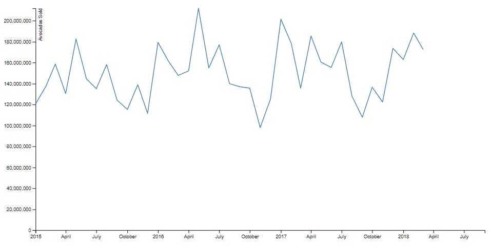
Now the history line.
innerChart.append('path')
  .datum(history)
  .attr('fill', 'none')
  .attr('stroke', 'steelblue')
  .attr('stroke-width', 1.5)
  .attr('d', line);
And finally, the forecast line.
innerChart.append('path')
  .datum(forecast)
  .attr('fill', 'none')
  .attr('stroke', 'tomato')
  .attr('stroke-dasharray', '10,7')
  .attr('stroke-width', 1.5)
  .attr('d', line);
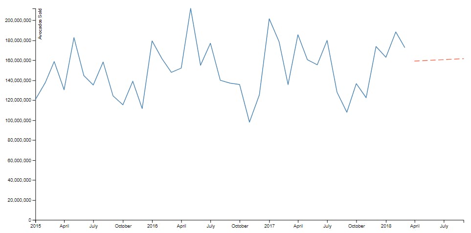
Notice how the forecast line is colored differently and has a dashed appearance. This is to help clarify that these aren’t real data points, but merely a prediction along a trend line.
Everything looks good, except there’s a break in the line chart. We can easily fill this in by giving our forecast array another data point that matches the last history data point exactly.
This situation is perfect for [array.prototype.unshift](developer.mozilla.org/en-US/docs/Web/JavaSc..), which adds new items to the beginning of an array. Simply add the last history data point to the beginning of the forecast array.
forecast.unshift(history[history.length - 1]);
Note that this needs to be done some time before adding the forecast line to the chart. I recommend doing it right after the step where we mapped over the forecast array.
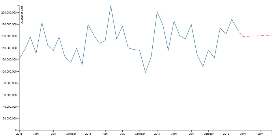 The final product: A chart with avocado sales history and forecast for the next six months
All of the code for this project can be viewed in its entirety in the pen below.