


D3 provides a powerful interface for reacting to changes in data. When hooked up to Vue, you can create data visualizations that react to your UI or even remote data sources.

Follow along and we’ll build something like this:
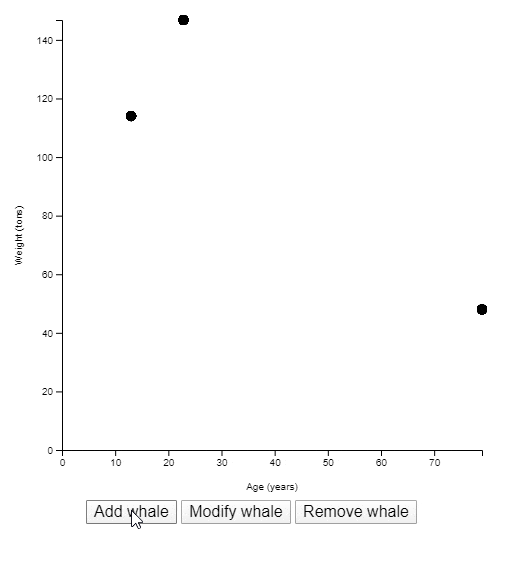 A chart with three buttons to add, modify, and remove data points. (random data is used here)
To get started, let’s make a tiny page with some bare-bones HTML and an <svg> element. Make sure the <svg> has an id.
<!doctype html>
<html lang="en">
  <head>
    <meta charset="utf-8">
    <title>Chart</title>
  </head>
  <body>
    <svg id="chart" viewBox="0 0 500 500"></svg>
  </body>
</html>
Since we’ll be using Vue.js and D3.js, let’s make sure to include them. Ideally, you’d be using a build step to pull in these dependencies and bundle them. But for now, simple <script> tags will work.
Below the <svg> tag, add the scripts.
<script src="[https://cdnjs.cloudflare.com/ajax/libs/vue/2.6.11/vue.min.js](https://cdnjs.cloudflare.com/ajax/libs/vue/2.6.11/vue.min.js)"></script>
<script src="[https://cdnjs.cloudflare.com/ajax/libs/d3/5.15.0/d3.min.js](https://cdnjs.cloudflare.com/ajax/libs/d3/5.15.0/d3.min.js)"></script>

<script>
  // Our code can go here
</script>
For this tutorial, we’ll plot some fake data regarding blue whales; starting with a very small sample size.
const whales = [
  { age: 13, weight: 114 },
  { age: 33, weight: 101 },
  { age: 52, weight: 139 }
];
Before we make it reactive, let’s focus on just getting a static chart built. A scatter plot would be a good way to visualize this data.
Start with some dimensions.
const width = 500;
const height = 500;
const margin = {
  top: 20,
  right: 20,
  bottom: 50,
  left: 60
};
Use these dimensions to place a <g> element that respects our margins. All other chart elements will be placed inside this <g>, so we’ll call it our chart.
const chart = d3.select("#chart")
  .append("g")
  .attr("transform", `translate(${margin.left}, ${margin.top})`);
Next, we’ll need some scales. The x axis will plot our whale ages. A linear scale works well for this kind of data.
The range of this scale is the width of our chart (minus the margins we set).
const x = d3.scaleLinear()
  .range([0, width - margin.left - margin.right]);
If you know anything about D3.js, you may be expecting the domain to be set at this time, as well. I’m intentionally omitting it for right now because I only want to set chart values that don’t change with the data. Domains react to data changes. Ranges do not.
The y axis will plot our whale weights. A linear scale also works well here.
The range of this scale is the height of our chart.
const y = d3.scaleLinear()
  .range([height - margin.top - margin.bottom, 0]);
Notice the first value of the y scale is the height, and the second value is 0. We want heavier weights at the top of the chart, and zero at the bottom.
Now let’s make some elements into which we can place the axes. We wont actually be placing the axes on the chart at this point, just the placeholder <g>s for them. Axes are another element that react to changes in data. If a new data point gets added where the age is older than any existing age in the chart, the x axis will have to adjust. Likewise for the y axis with weights.
const xAxis = chart.append("g")
  .attr(
    "transform",
    `translate(0, ${height - margin.top - margin.bottom})`
  );

const yAxis = chart.append("g");
Notice the xAxis is shifted down so it’s at the bottom of the chart. The yAxis doesn’t need to be shifted because it starts at the upper left corner of the chart anyway.
With all of the static elements and values taken care of, it’s time to code the parts of the chart that react to data changes.
Place all of this code in a new function we’ll call plot().
const plot = () => {
  // Code to plot data goes here.
};
The first thing to do inside this function is set the domain of our scales.
x.domain([0, d3.max(whales, d => d.age)]);
y.domain([0, d3.max(whales, d => d.weight)]);
Now we can call our axes and finally get some visual result on our page.
xAxis.call(d3.axisBottom(x));
yAxis.call(d3.axisLeft(y));
Let’s see what this looks like on our page. Immediately after defining the plot() function, call it.
Note that this function call goes outside the function definition itself.
plot();
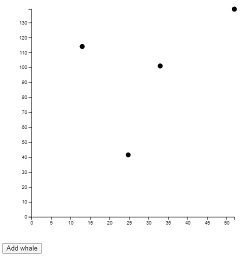
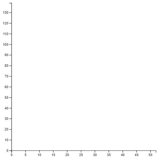 The visual result of the code we’ve written so far.
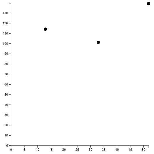
There’s only one more declaration we have to make in order to place dots on this chart.
Back inside the plot() function, add the code for appending <circle> elements.
chart.selectAll(".point")
  .data(whales)
  .join("g")
  .attr("class", "point")
  .attr("transform", d => `translate(${x(d.age)}, ${y(d.weight)})`)
  .append("circle")
  .attr("r", 5);
If you are not familiar with D3.js and you’re confused by the code above, you may consider reading up on D3 data joins.
Basically, we’re binding all elements with a class of point to our data. The .join() here takes care of adding the appropriate elements if they don’t yet exist, modifying elements if they do, and removing extra elements if there’s more of them than there are data points. Once the elements and data are bound, we add a <circle> with an r (radius) of 5 pixels for each one.
The chart is now mostly usable.
The way we’ve coded this chart makes it easy to update when data changes. Every time plot() is called, the data is re-analyzed and the chart updates.
Adapting the chart for use in Vue
This chart is great and all, but how is it usable in Vue.js?
Just to get started, let’s wrap our <svg> in a new <div> to which we can bind a Vue component.
<div id="app">
  <svg id="chart" viewBox="0 0 500 500"></svg>
</div>
Back in the JavaScript, define a new Vue instance.
new Vue({
  el: "#app",
  data: {},
  watch: {},
  methods: {},
  mounted() {}
});
Now cut all of the other JavaScript we’ve written so far and paste it into the mounted() function.
new Vue({
  el: "#app",
  data: {},
  watch: {},
  methods: {},
  mounted() {
    const whales = [ /* ... snip ... */ ];
    const width = 500;
    /* ... snip ... */
    plot();
  }
});
To keep the article concise, I’ve snipped out a lot of the code we’ve already written.
The result in the browser at this point should be the same as before we started writing any Vue code.
Now we’ll move some data and functions into their respective Vue environments. whales is a data variable, so move it into the data property.
data: {
  whales: [
    { age: 13, weight: 114 },
    { age: 33, weight: 101 },
    { age: 52, weight: 139 }
  ]
},
Once you remove const whales = [ ... snip ... ] from the mounted() function, the chart will break. To fix it, find all references to whales and change them to this.whales. This will make each reference look in the view-model’s data attribute.
The plot() function should become a Vue method, so cut and paste it into the methods property.
methods: {
  plot() {
    x.domain([0, d3.max(this.whales, d => d.age)]);
    y.domain([0, d3.max(this.whales, d => d.weight)]);

    /* ... snip ... */
  }
},
Don’t forget to update the call to plot() to this.plot().
Even updating the call to this.plot(), the chart is still broken. Looking at the error in the console, I see:
ReferenceError: x is not defined
  at wn.plot
  at wn.mounted
Aha! The plot() method cannot access our x scale because it’s declared in the mounted() function’s scope. Looking at the rest of the code, I can see we’ll run into the same issue with all of these variables:
xyxAxisyAxischart
Update all of those those declarations so they’re data attributes. In practice, this means changing all of these:
const chart = /* .. snip .. */
const x = /* .. snip .. */
const y = /* .. snip .. */
const xAxis = /* .. snip .. */
const yAxis = /* .. snip .. */
To this:
this.chart = /* .. snip .. */
this.x = /* .. snip .. */
this.y = /* .. snip .. */
this.xAxis = /* .. snip .. */
this.yAxis = /* .. snip .. */
With the declarations taken care of, now you must update all references to any of the above variables to this.x and this.y, etc.
For example, in plot(), the first line says:
x.domain([0, d3.max(this.whales, d => d.age)]);
This should be changed to:
this.x.domain([0, d3.max(this.whales, d => d.age)]);
Do this for all references to chart, x, y, xAxis, and yAxis. When you’re finished, you should see the chart on your page once again.
Finally, we just need to write a simple piece of code that will cause the plot() method to be called whenever whales changes. A Vue watcher works well here.
watch: {
  whales: {
    deep: true,
    handler() { this.plot(); }
  }
},
This code watches the whales data property and calls the plot() method any time it or any of its values changes.
To test this out, you can add a button that adds a new whale.
<button [@click](http://twitter.com/click)="addWhale">Add whale</button>
Make sure the button is a child of <div id="app"> so it’s part of the Vue app.
Now add a method that pushes a new randomly generated whale data point.
methods: {
  plot() { /* .. snip .. */ },
  addWhale() {
    this.whales.push({
      age: Math.random() * 80,
      weight: Math.random() * 200
    });
  }
},
If you click the button, you see another data point added to the chart.
 The chart now has four data points because I clicked “Add whale”
If you click it enough times, you’ll probably get one that has an age or weight outside the bounds of our original three. In that case, you can see the chart update to accommodate the new maximum values.
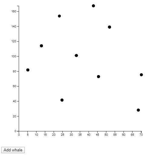 The chart now has data points outside the original age and weight boundaries
How about modifying and removing existing data points. You can create two new buttons.
<button [@click](http://twitter.com/click)="modifyWhale">Modify whale</button>
<button [@click](http://twitter.com/click)="removeWhale">Remove whale</button>
And two new methods.
modifyWhale() {
  if (this.whales.length > 0) {
    const i = Math.floor(Math.random() * this.whales.length);
    this.whales[i].age = Math.floor(Math.random() * 80);
    this.whales[i].weight = Math.floor(Math.random() * 200);
  }
},
removeWhale() {
  if (this.whales.length > 0) {
    const i = Math.floor(Math.random() * this.whales.length);
    this.whales.splice(i, 1);
  }
}
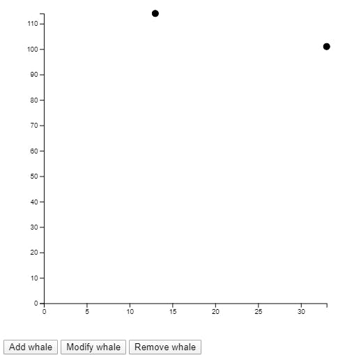
Clicking “Modify whale” changes a random data point.
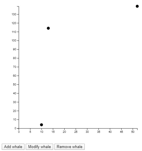
Clicking “Remove whale” removes a random one.
That’s it! You can build any form of interactivity into your Vue app. Any time the chart data changes, the chart updates. You could even have your data hooked up to a remote source that gets updated through fetch, websockets, or an EventSource.
Adding some missing details
While not directly in the scope of this article, it’s important that we label our data. I added a title to the HTML.
<div id="app">
  **<h1>Blue Whales</h1>**
  <svg id="chart" viewBox="0 0 500 500"></svg>
  <button [@click](http://twitter.com/click)="addWhale">Add whale</button>
  <button [@click](http://twitter.com/click)="modifyWhale">Modify whale</button>
  <button [@click](http://twitter.com/click)="removeWhale">Remove whale</button>
</div>
And I added axis labels using D3. This code goes in the mounted() section.
this.chart.append("text")
  .attr("font-size", 10)
  .attr("text-anchor", "middle")
  .attr("x", (width - margin.left - margin.right) / 2)
  .attr("y", height - margin.top - margin.bottom + 40)
  .text("Age (years)");

this.chart.append("text")
  .attr("font-size", 10)
  .attr("text-anchor", "middle")
  .attr("transform", "rotate(-90)")
  .attr("x", 0 - ((height - margin.top - margin.bottom) / 2))
  .attr("y", -40)
  .text("Weight (tons)");
The finished product (with a small set of CSS styles) can be found in the pen below.