 Travis Horn
Self-contained D3 Bar Chart Function

D3 is a great data visualization library. I often find myself coding the same types of charts over and over again. I decided that it would be wise to build each basic chart type I use into a single self-contained function that can be included and called on any page. These functions should create a static chart from a set of data and insert it into any element.
This post is the first in a series where I write a function for each chart type. In this post, we’ll be writing a bar chart function. In the next one, you can find out how to write a pie chart function.
The Goal
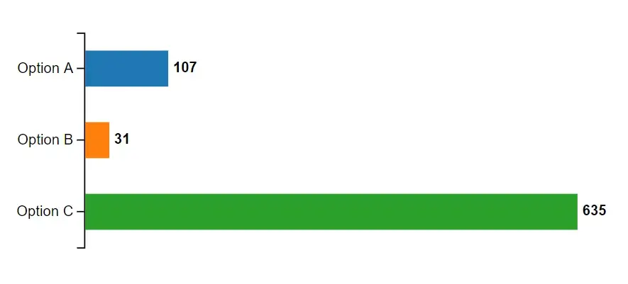
Say we have data in this format.
[
  { "name": "Option A", "value": 107 },
  { "name": "Option B", "value": 31 },
  { "name": "Option C", "value": 635 }
]
And we want to visualize it like this.
The Function
Let’s write a function that accepts two arguments.
const barChart = (selector, data) => {
  // All the rest of the code goes here
};
The first parameter, selector, will be the DOM element in which to add the
chart. The second parameter, data, will be the data to visualize.
At the top of the function, we need to define some constants.
const barHeight = 30;
const width = 500;
const height = data.length * (barHeight * 2);
const margin = { top: 0, right: 30, bottom: 1, left: 60 };
const container = d3.select(selector);
You can modify the bar height if desired. You could even set it based on an option passed to the function. But for the sake of simplicity, I’m just hard coding a value.
The width, however, should stay 500. This is because 500 isn’t the actual width, but the width of the viewBox. The actual width will always expand to the full width of the containing element.
The height is determined from the number of data points multiplied by the height of each bar, plus some extra room for gutters between bars. This makes the chart shorter or taller depending on the number of data points we’re charting.
The margins are important to make sure axis and data labels fit on the chart.
The container is a D3 element selected based on the passed-in selector string.
Next, we can use D3 to add an SVG element.
const chart = container
  .append("svg")
  .style("width", "100%")
  .attr("viewBox", `0 0 ${width} ${height}`);
The width is set to 100% so the chart will always take up the entire width of its containing element.
The viewBox is a way to define the extent of the virtual canvas. We’ll start
at x & y coordinates 0, 0 and go all the way to the width and height we set
earlier.
Scales
Let’s code the x axis’s scale.
const xScale = d3
  .scaleLinear()
  .range([0, width - margin.left - margin.right])
  .domain([0, d3.max(data, (d) => d.value)]);
This creates a function called xScale(). You feed the function a number from
the data and it returns a related number along the width (x axis) of the chart.
The range is a 2-point array where the first number is the left edge of the
chart and the second number is the right edge. So the left edge is 0. Even
though there is a left margin, we still set 0 because we’ll
translate
our chart elements to the right later. For the right edge, we can use the width
we set earlier. But we also need to take into consideration the margins.
The domain is, similarly, a 2-point array. The first number is the lowest
value on the chart. For bar charts, 0 is always a good starting point. The
second number is the highest value we will chart. We can use D3’s max
function to find this value in the
data.
If you feed this function a value from our data:
xScale(107);It will always return the same x position along the width of our chart:
69.08661417322836With the x axis scale done, we can move on to the y axis scale.
const yScale = d3
  .scaleBand()
  .range([0, height - margin.top - margin.bottom])
  .domain(data.map((d) => d.name));
This scale is similar, with a few differences. For the x axis, we used a linear scale because that fit with our data’s values. This time, however, we will be using a band scale because our y axis will be divided into bands for each option.
The range is the height of the chart and the domain is the name of the data points (Option A, Option B, and Option C).
If you feed this scale function the name of a data point:
yScale("Option B");It will always return the same y position along the height of our chart:
59.666666666666664This is helpful for placing bars neatly along the y axis.
Along with the x and y scales, we will use one more scale: the color scale.
const color = d3
  .scaleOrdinal()
  .range(d3.schemeCategory10)
  .domain(data.map((d) => d.name));
This is an ordinal scale where we set the range to an array of colors (specified
by
d3.schemeCategory10
in this case, but you can change it to any array of colors you’d like). The
domain is again the name of our data points.
If you feed this function the name of a data point:
color("Option C");It will always return the same color:
"#2ca02c"This will be useful for coloring the bars.
All the scales are done.
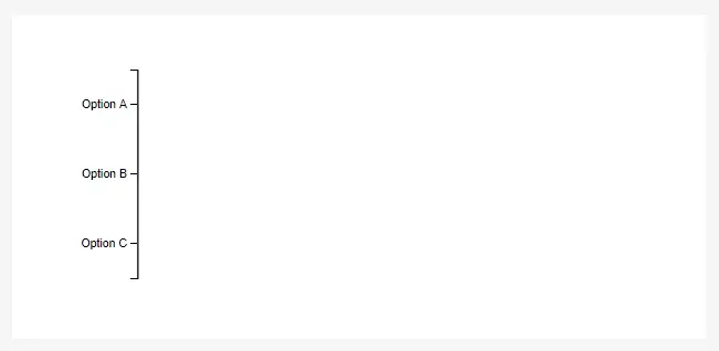
Visualizing the Y Axis
D3 provides tools for creating axes. Our y axis is coded like this.
const yAxis = chart
  .append("g")
  .call(d3.axisLeft(yScale))
  .attr("transform", `translate(${margin.left}, ${margin.top})`);
We append a <g> element and call
d3.axisLeft on it. d3.axisLeft takes a
scale as it’s only argument. We simply pass in the y scale we made earlier. Then
we translate the axis to push it to the right and down a little bit according to
our margins.
At this point, if you were to…
- Create a web page
- Add a
<div> - Give it an
id - Include D3, and
- Include the script we’ve been working on
<html>
  <body>
    <div id="chart"></div>
    <script src="d3.js"></script>
    <script src="barChart.js"></script>
  </body>
</html>
Then we could call the function with our data.
barChart("#chart", [
  { name: "Option A", value: 107 },
  { name: "Option B", value: 31 },
  { name: "Option C", value: 635 },
]);
And the beginnings of the chart appear. Right now, only the axis is visualized.
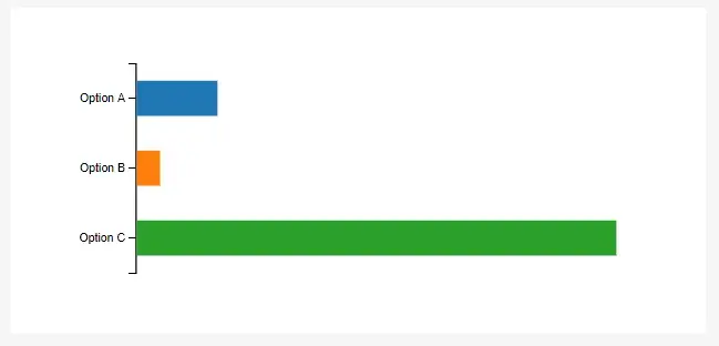
Bars
Adding the bars is done with one long chain.
chart
  .selectAll(".bar")
  .data(data)
  .enter()
  .append("rect")
  .attr("class", "bar")
  .attr("fill", (d) => color(d.name))
  .attr("height", barHeight)
  .attr("width", (d) => xScale(d.value))
  .attr("x", margin.left + 1)
  .attr("y", (d) => yScale(d.name) + barHeight / 2);
We select all elements with class bar on the chart. There aren’t any
currently, but this step is still necessary.
We tie each bar element to our data.
We tell D3 that for each new data point that doesn’t currently have a bar
assigned to it, append a new
rect.
Then finally, shape the rect attributes:
classis set tobarfillis set to a color based on the data point’s name and thecolorscaleheightis set from ourbarHeightvariable defined at the beginning.widthis set from the data point’s value and thexScalexis set to just a little after the left marginyis set from a combination of the data point’s name, theyScaleband scale, and thebarHeight.
Now the chart is starting to come together.
Data Labels
Some data labels will be helpful. These are also set from one big chain.
chart
  .selectAll(".label")
  .data(data)
  .enter()
  .append("text")
  .attr("class", "label")
  .attr("alignment-baseline", "middle")
  .attr("x", (d) => xScale(d.value) + margin.left + 5)
  .attr("y", (d) => yScale(d.name) + barHeight)
  .style("font-size", "12px")
  .style("font-weight", "bold")
  .text((d) => d.value);
It’s very similar to the bar chain, but we’re inserting text elements and
setting different attributes to position them correctly alongside the bars.
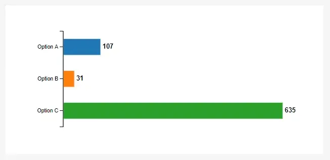
Our chart is functionally complete!
Finishing Touches
One last thing — and it’s purely style — I think the axis would look a little better with a larger font size.
yAxis.selectAll("text").style("font-size", "12px");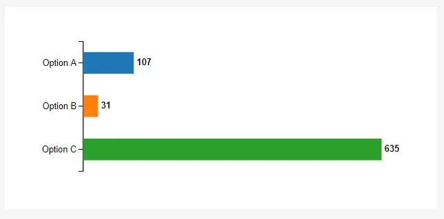
Putting it all Together
The entire function looks like this.
const barChart = (selector, data) => {
  const barHeight = 30;
  const width = 500;
  const height = data.length * (barHeight * 2);
  const margin = { top: 0, right: 30, bottom: 1, left: 60 };
  const container = d3.select(selector);

  const chart = container
    .append("svg")
    .style("width", "100%")
    .attr("viewBox", `0 0 ${width} ${height}`);

  const xScale = d3
    .scaleLinear()
    .range([0, width - margin.left - margin.right])
    .domain([0, d3.max(data, (d) => d.value)]);

  const yScale = d3
    .scaleBand()
    .range([0, height - margin.top - margin.bottom])
    .domain(data.map((d) => d.name));

  const color = d3
    .scaleOrdinal()
    .range(d3.schemeCategory10)
    .domain(data.map((d) => d.name));

  const yAxis = chart
    .append("g")
    .call(d3.axisLeft(yScale))
    .attr("transform", `translate(${margin.left}, ${margin.top})`);

  chart
    .selectAll(".bar")
    .data(data)
    .enter()
    .append("rect")
    .attr("class", "bar")
    .attr("fill", (d) => color(d.name))
    .attr("height", barHeight)
    .attr("width", (d) => xScale(d.value))
    .attr("x", margin.left + 1)
    .attr("y", (d) => yScale(d.name) + barHeight / 2);

  chart
    .selectAll(".label")
    .data(data)
    .enter()
    .append("text")
    .attr("class", "label")
    .attr("alignment-baseline", "middle")
    .attr("x", (d) => xScale(d.value) + margin.left + 5)
    .attr("y", (d) => yScale(d.name) + barHeight)
    .style("font-size", "12px")
    .style("font-weight", "bold")
    .text((d) => d.value);

  yAxis.selectAll("text").style("font-size", "12px");
};
It has one simple dependency: D3.