 Travis Horn
Visualizing Google Sheets Data in D3

If you have data in Google Sheets, you can import and visualize it using D3.
Creating the table
Maybe you already have data in Google Sheets. If so, you may skip this section. For the sake of demonstration, I’ll show how to create a new sheet with some data.
First, go to Google Drive and log in if necessary.
Click New > Google Sheets
Enter some data. Do not worry about formatting. In fact, the less formatting there is, the easier it will be understand the shape of the data. Keep it simple.
For my example, I typed in some random data about fake organizations.
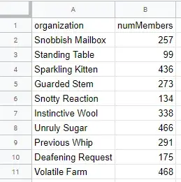
This is just sample data. Feel free to copy it and use it yourself.
| organization | numMembers |
|---|---|
| Snobbish Mailbox | 257 |
| Standing Table | 99 |
| Sparkling Kitten | 436 |
| Guarded Stem | 273 |
| Snotty Reaction | 134 |
| Instinctive Wool | 338 |
| Unruly Sugar | 466 |
| Previous Whip | 291 |
| Deafening Request | 175 |
| Volatile Farm | 468 |
Publish the data
In order to pick it up using D3, we’re going to have to “publish” the data in Google Sheets.
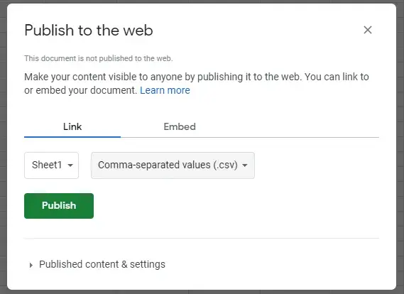
Click File > Publish to web
In the first dropdown menu, select the name of the sheet which contains your data. In my case, I didn’t set a custom name, so my sheet is simply called Sheet1.
In the second dropdown menu, select Comma-separated values (.csv).
Your screen should look similar to this.
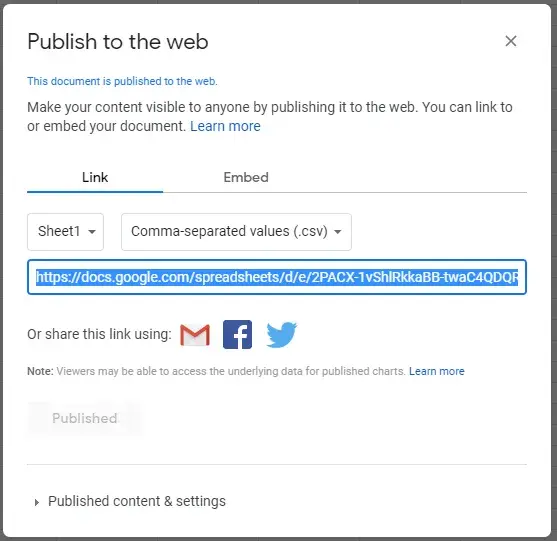
Click Publish.
You may be asked if you’re sure you want to publish the selection. Click OK.
A link is generated to your data in CSV format. Copy or otherwise make a note of the generated link.
Set up a web page with D3
With the data ready to go, we must now do some boilerplate work to set up D3.
On an HTML page, create an SVG element to contain our chart. Make sure to give
it an id that we can use to select it later. I’m giving mine the dimensions of
500 by 300. This makes my chart a little wider than it is tall.
<!doctype html>
<html>
  <head>
    <meta charset="utf-8" />
    <title>Visualization</title>
  </head>
  <body>
    <svg id="chart" viewBox="0 0 500 300"></svg>
  </body>
</html>
At the bottom of the <body> element, below the <svg> element, include D3.
<script src="https://d3js.org/d3.v5.min.js"></script>And below that, create a new <script> element that will hold all the rest of
our visualization code.
<script>
  // Everything else will go here
</script>
Inside the script, I’m going to create a new function that draws our chart. I’ll also call it right now, even though it’s empty.
const drawChart = async () => {
  // Everything else will go here
};

drawChart();
The reason I’m creating a separate function instead of just coding it directly
is so I can make use of the async and await keywords.
Importing the data using D3
D3 provides a handy function for importing CSV data via a URL. This is great because we have a URL with our data in CSV format now.
Inside the drawChart function, import the data.
const data = await d3.csv("https://docs.google.com/spreadsheet...");Replace the URL above with the URL that you copied when publishing the Google Sheet.
An important note on data types
I noticed that I would have issues with numbers coming from Google Sheets. Sometimes they would come in as strings. There may be ways to fix this formatting. But I’ve found the best way is to coerce the numbers in JavaScript.
For example, when creating a scale, you can coerce the “number” to an actual
number using the + operator.
const y = d3
  .scaleLinear()
  .range([0, 100])
  .domain([0, d3.max(data, (d) => +d.numMembers)]);
Notice the + in front of d.numMembers. This makes it so the scale treats it
as a number (i.e. 99) instead of a string (i.e. "99") no matter the data
type it was imported as.
A simple chart
Now you have the data in JavaScript so you can use it with D3. The rest is up to however you want to visualize it. I’ll go ahead and build a simple chart now.
Set up some basic constants we’ll use later.
const viewBox = d3.select("#chart").attr("viewBox").split(" ");
const width = viewBox[2];
const height = viewBox[3];
const margin = { top: 0, right: 0, bottom: 60, left: 60 };
const chart = d3
  .select("#chart")
  .append("g")
  .attr("transform", `translate(${margin.left}, ${margin.top})`);
Create the x axis scale. These will be “bands” according to the fake organizations I entered into Google Sheets.
const x = d3
  .scaleBand()
  .range([0, width - margin.left - margin.right])
  .domain(data.map((d) => d.organization))
  .paddingInner(0.3);
Create the y axis scale. This will be a linear scale according to the number of members in each organization.
const y = d3
  .scaleLinear()
  .range([height - margin.top - margin.bottom, 0])
  .domain([0, d3.max(data, (d) => +d.numMembers)]);
Place an x axis along the bottom.
const xAxis = chart
  .append("g")
  .attr("class", "axis-x")
  .attr("transform", `translate(0, ${height - margin.top - margin.bottom})`)
  .call(d3.axisBottom(x));
The names are a little long and run into each other. We can reposition and rotate them.
xAxis
  .selectAll("text")
  .attr("x", -3)
  .attr("y", 3)
  .attr("text-anchor", "end")
  .attr("transform", "rotate(-30)");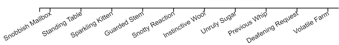
The domain and tick lines are actually unnecessary for a simple chart like this. Let’s remove them.
xAxis.selectAll(".domain, .tick line").remove();
Let’s “D3 join” our data with some container <g> elements.
const value = chart
  .selectAll(".value")
  .data(data)
  .join("g")
  .attr("class", "value")
  .attr(
    "transform",
    (d) => `translate(${x(d.organization)}, ${y(d.numMembers)})`,
  );
Notice each <g> element is translated along the chart according to the x and y
scales.
Now we can append a rectangle to each value container.
value
  .append("rect")
  .attr("width", x.bandwidth())
  .attr("height", (d) => height - margin.top - margin.bottom - y(d.numMembers));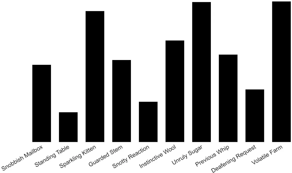
Last but not least, data labels will tell us the actual value for each organization.
value
  .append("text")
  .attr("text-anchor", "middle")
  .attr("font-size", 8)
  .attr("font-family", "Arial, sans-serif")
  .attr("fill", "white")
  .attr("x", x.bandwidth() / 2)
  .attr("y", 11)
  .text((d) => d.numMembers);
The full version of this code and a live demo can be seen on CodePen.