


Building on the last article, I’ll show you how to use the SparkLine component we built to create a “dashboard” of data points that anyone can quickly understand with sparklines.
In the previous article, we created a Vue component which accepts an array of numbers and creates a sparkline chart. Build a Sparkline Vue Component Sparklines can be useful for quickly visualizing data variance. They are small and intuitive to understand.travishorn.com
Now, we can make a dashboard with that component.
If you don’t already have one created, you should create a Vue project with the Vue CLI.
vue create sparkboard
Either choose to use default options or customize to your preference.
Once you have a Vue project created, make sure the SparkLine.vue component we created last time is in the components/ directory. You may choose to copy it from the repository on GitHub.
Next, replace the entirety of App.vue with the following.
<template>
<div style="width:100px">
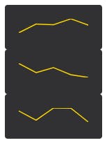
<SparkLine :data="[808, 1475, 1426, 1884, 1396]" />
<SparkLine :data="[3246, 1941, 2649, 1633, 1262]" />
<SparkLine :data="[190, 128, 209, 208, 116]" />
</div>
</template>
<script>
import SparkLine from "./components/SparkLine.vue";
export default {
name: "App",
components: {
SparkLine
}
};
</script>
Note that the arrays of data here are just random numbers I picked. Feel free to use whatever you’d like. Later we can pull data from external sources.
Run the development server.
npm run serve
You can view the project at http://localhost:8080/
Great! There’s three tiny sparklines just as the code describes.
I don’t like putting the data directly into the template, so the first thing we’ll do is move it into the script.
Let’s pretend our data comes from a set of sensors. The updated script looks like this:
import SparkLine from "./components/SparkLine.vue";

export default {
  name: "App",
  data() {
    return {
      sensors: [
        [808, 1475, 1426, 1884, 1396],
        [3246, 1941, 2649, 1633, 1262],
        [190, 128, 209, 208, 116]
      ]
    };
  },
  components: {
    SparkLine
  }
};
And the template can be modified to loop over this array of sensor data like this:
<div style="width:100px">
  <div class="sensor" v-for="sensor in sensors" :key="sensor">
    <SparkLine :data="sensor" />
  </div>
</div>
So far, no visual change has been made, but moving the data into the script makes it much more flexible.
Right now, our entire app is 100 pixels wide. Instead, we should remove this style from the root element.
<div>
  <div class="sensor" v-for="sensor in sensors" :key="sensor">
    <SparkLine :data="sensor" />
  </div>
</div>
And instead add it to individual sensor <div>s. This requires us to add a <style scoped> section to the bottom of App.vue.
<style scoped>
.sensor {
  width: 100px;
}
</style>
Now that we can style each sensor, it’s time to add some basic styles.
Some padding, rounded corners, and color will make a big difference.
.sensor {
  width: 100px;
  padding: 20px;
  border-radius: 4px;
  background-color: #313133;
}
I’m a fan of CSS grids. So I’m going to add a class to the root element…
<div class="sensors">
  <div class="sensor ... snip ...>
    <!-- ... snip ...>
  </div>
</div>
…and give it some grid styles.
.sensors {
  display: grid;
  grid-template-columns: repeat(auto-fit, minmax(200px, 1fr));
  grid-gap: 20px;
}
These styles make the sensors show up in a grid that will automatically adjust for screen size.
We’ll also need to remove the width from each sensor, and instead add a max-width.
.sensor {
  max-width: 200px;
  padding: 20px;
  /* ... snip ... */
}
The chart itself doesn’t need to take up so much of the box. Add a class…
<SparkLine class="sensor-chart" :data="sensor" />
…and style it accordingly.
.sensor {
  /* ... snip ... */
  text-align: center;
}

.sensor-chart {
  width: 50%;
}
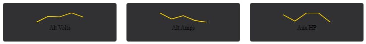
Each of these sensors surely has a name. We can add that in the data.
data() {
    return {
      sensors: [
        { name: "Alt Volts", data: [808, 1475, 1426, 1884, 1396] },
        { name: "Alt Amps", data: [3246, 1941, 2649, 1633, 1262] },
        { name: "Aux HP", data: [190, 128, 209, 208, 116] }
      ]
    };
  },
Since we changed the format of our data, we need to update the template.
<div class="sensors">
  <div class="sensor" v-for="sensor in sensors" :key="sensor.name">
    <SparkLine class="sensor-chart" :data="sensor.data" />
  </div>
</div>
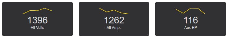
Now we can add the name below each chart.
<div class="sensors">
  <div class="sensor" v-for="sensor in sensors" :key="sensor.name">
    <SparkLine class="sensor-chart" :data="sensor.data" />
    <div class="sensor-name">{{ sensor.name }}</div>
  </div>
</div>
The font can be a little smaller, too.
.sensor-name {
  font-size: 12px;
}
Oops. It’s hard to read. We can change the font and color directly in the .sensor-name style, but I know we’re going to be adding some more text, so I’m going to make the change higher up.
.sensors {
  /* ... snip ... */
  font-family: sans-serif;
  color: #d8d9da;
}

It’s starting to come together. How about we show the most recent data point for each sensor? Note the new lines in bold below.
<div class="sensors">
    <div class="sensor" v-for="sensor in sensors" :key="sensor.name">
      <SparkLine class="sensor-chart" :data="sensor.data" />

      <div class="sensor-value">
        {{ sensor.data[sensor.data.length - 1] }}
      </div>

      <div class="sensor-name">{{ sensor.name }}</div>
    </div>
  </div>
We can make these numbers bigger as you can imagine they might be valuable to see at a glance.
.sensor-value {
  font-size: 30px;
}
Just for personal preference, I’m going to set the entire background to a darker color. You can place this right alongside <style scoped>.
<style>
body {
  background-color: #212124;
}
</style>
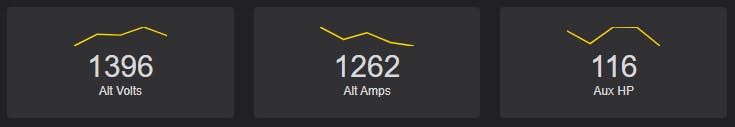
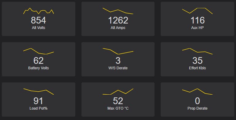
And the styles are complete! Let’s see what it looks like with many more sensors.
sensors: [
        { name: "Alt Volts", data: [808, 1475, 1426, 1884, 1396] },
        { name: "Alt Amps", data: [3246, 1941, 2649, 1633, 1262] },
        { name: "Aux HP", data: [190, 128, 209, 208, 116] },
        { name: "Battery Volts", data: [73, 101, 49, 37, 62] },
        { name: "W/S Derate", data: [5, 4, 1, 2, 3] },
        { name: "Effort Kbls", data: [61, 74, 48, 52, 35] },
        { name: "Load Pot%", data: [99, 96, 95, 97, 91] },
        { name: "Max GTO °C", data: [23, 21, 44, 26, 52] },
        { name: "Prop Derate", data: [4, 2, 5, 1, 0] },
        { name: "MPH", data: [18, 20, 21, 23, 26] },
        { name: "TE", data: [8, 9, 5, 7, 6] },
        { name: "Read No.", data: [9811, 9812, 9813, 9814, 9815] },
        { name: "Engine RPM", data: [1096, 598, 661, 777, 1027] },
        { name: "Gross HP", data: [5959, 2163, 3935, 3443, 4566] },
        { name: "Water °F", data: [243, 98, 101, 193, 184] },
        { name: "Oil °F", data: [253, 143, 150, 232, 215] },
        { name: "MPH/Minute", data: [5, 6, 4, 2, 3] }
      ]
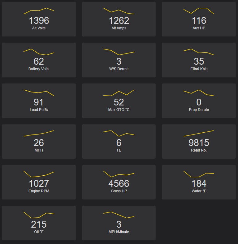
It looks good! And the best part? Everything is dynamic. You can change the data and everything updates.
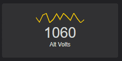
Say you poll for updated data via an API. You simply replace or modify any of the sensors’ data properties and the dashboard will update.
Here’s some code that adds a random data point to the first sensor’s array every second. It also “caps” the array to the latest 15 values only.
setInterval(() => {
  this
    .sensors[0]
    .data
    .push(Math.floor(Math.random() * 800 + 800));

  this.sensors[0].data = this.sensors[0].data.slice(-15);
}, 1000);
The code for this article is open source and can be found on GitHub. travishorn/vue-sparkline-component Basic sparkline component for Vue.js using D3.js. See how this component was built step-by-step. npm install npm run…github.com
Most of what was written today is contained in src/App.vue.