


One cool feature of CSS is the transition rules you can apply to elements. You can use transitions to animate icons when they are clicked.
A burger menu icon is a common design element on the web. This icon conveys to the user that, if they tap it, a menu will open.
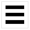 A burger menu icon
You can create this icon using HTML and CSS. The HTML is simple:
<div class="burger-menu">
  <div class="line line-1"></div>
  <div class="line line-2"></div>
  <div class="line line-3"></div>
</div>
A container div with class burger-menu contains three divs with the line class. Each line also has their own line-x class so we can reference them individually.
Here’s the CSS for .burger-menu:
.burger-menu {
  position: relative;
  width: 100px;
  height: 100px;
  border: solid 1px lightgray;
}
We set position: relative because the lines will all be positioned absolutely to it. Then we make it square at 100 pixels and give it a simple border.
The CSS shared between all lines looks like this:
.burger-menu .line {
  position: absolute;
  left: 14px;
  width: 72px;
  height: 14px;
  background-color: black;
}
The lines are positioned absolutely within their container. They are all shifted from the left edge a little bit. They are all 72 pixels wide and 14 pixels high. And they are all black.
Now, each individual line needs to be shifted from the top a certain distance:
.burger-menu .line-1 { top: 14px; }
.burger-menu .line-2 { top: 42px; }
.burger-menu .line-3 { top: 72px; }
Nice! Our burger menu is complete. The full HTML and CSS is:
<!-- HTML -->
<div class="burger-menu">
  <div class="line line-1"></div>
  <div class="line line-2"></div>
  <div class="line line-3"></div>
</div>


/* CSS */
.burger-menu {
  position: relative;
  width: 100px;
  height: 100px;
  border: solid 1px lightgray;
}

.burger-menu .line {
  position: absolute;
  left: 14px;
  width: 72px;
  height: 14px;
  background-color: black;
}

.burger-menu .line-1 { top: 14px; }
.burger-menu .line-2 { top: 42px; }
.burger-menu .line-3 { top: 72px; }
When the user taps this icon, they can expect a menu to open. But what if they want to close the menu later? If this icon is still visible, they may figure tapping it again will close the menu. And they may be correct. But a better way to convey that a button will close something would be to display an X.
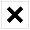 An X icon
Before we get to animating the icon, let’s first design the X icon. We’ll re-use two of the burger menu icon’s lines.
First, add the class toggled to the .burger-menu. (Add the class in bold below).
<div class="burger-menu **toggled**">
  <div class="line line-1"></div>
  <div class="line line-2"></div>
  <div class="line line-3"></div>
</div>
Now we need to use CSS to tell the browser that whenever our burger menu is toggled, remove the middle line ( line-2 ) and then rotate the top and bottom lines ( line-1 and line-3 ).
.burger-menu.toggled .line-2 { opacity: 0; }

.burger-menu.toggled .line-1 {
  transform: translateY(28px) rotate(45deg);
}

.burger-menu.toggled .line-3 {
  transform: translateY(-28px) rotate(-45deg);
}
Setting opacity: 0 on .line-2 means that it will be completely transparent (not visible at all).
Setting transform: translateY(...) means that the line will be moved along the Y axis (up or down) a specific distance. In our case 28px for .line-1 (down) and -28px for .line-3 (up).
Setting transform: rotate(...) means that the line will be rotated at a specific angle. In our case 45 degrees for .line-1 (clockwise) and -45 degrees for .line-3 (counter-clockwise).
Where are we so far?
When our HTML looks like this…
<div class="burger-menu">
  <div class="line line-1"></div>
  <div class="line line-2"></div>
  <div class="line line-3"></div>
</div>
…the icon looks like this:

And when our HTML looks like this (notice the extra class)…
<div class="burger-menu **toggled**">
  <div class="line line-1"></div>
  <div class="line line-2"></div>
  <div class="line line-3"></div>
</div>
…the icon looks like this:

It is possible to switch between these two states using purely CSS, but the method involves hacky code that abuses the checkbox syntax.
Instead, a much more declarative way to switch between the base and toggled states is by using JavaScript.
First, add a new class called toggleable to our icon:
<div class="burger-menu **toggleable**">...</div>
Now, in JavaScript, we can grab all our toggleable icons (even though there is only one at the moment):
const toggleables = document.querySelectorAll('.toggleable');
For each toggleable icon, we want to listen for clicks:
toggleables.forEach((toggleable) => {
  toggleable.addEventListener('click', toggleIcon);
});
The code above means that any time a toggleable icon is clicked, the toggleIcon function is fired. Let’s create that function now.
const toggleIcon = (e) => {
  // Code to set the toggled class goes here
}
In the above function, the e argument contains a reference to the click event. This is useful because we can figure out which icon was clicked from it. Normally, you could just use e.target to get this information, but there’s a problem!
e.target will vary depending on whether the user clicked on the container .toggleable div or any of the children .line divs.
Instead, we can use e.composedPath(). It returns an array that starts with the actual element clicked, but also contains all of its parents; all the way up to Window.
When the user clicks on the container div, e.composedPath() returns:
[
  div.burger-menu.toggleable,
  body,
  html.-webkit-
  document,
  Window
]
But if a user clicks on any of the lines, it will look something like this:
[
  div.line.line-2
  div.burger-menu.toggleable,
  body,
  html.-webkit-
  document,
  Window
]
Remember that adding .toggled to the .toggleable element is what actually changes our icon. So no matter what element the user clicks on, our goal is to add .toggled to the .toggleable element — in this case, it’s div.burger-menu.toggleable. Sometimes that will be array index 0 and other times it will be index 1.
We can use Array.find() to find the element that contains the toggleable class:
const icon = e.composedPath().find((el) => {
  return el.classList.contains('toggleable');
});
Great! Now, we have a reference to the .toggleable div. If our icon is already toggled, remove the toggled class. Otherwise, add it.
if (icon.classList.contains('toggled')) {
  icon.classList.remove('toggled');
} else {
  icon.classList.add('toggled');
}
Our finished JavaScript looks like this:
const toggleables = document.querySelectorAll('.toggleable')

const toggleIcon = (e) => {
  console.log(e.path);
  const icon = e.path.find((el) => {
    return el.classList.contains('toggleable');
  });

  if (icon.classList.contains('toggled')) {
    icon.classList.remove('toggled');
  } else {
    icon.classList.add('toggled');
  }
};

toggleables.forEach((toggleable) => {
  toggleable.addEventListener('click', toggleIcon);
});
Clicking the icon — whether it’s the container or any of the lines within it — will toggle the toggled class, and therefor switch the icon.
The last piece is to actually animate the icon. We already have our two states, we just need to ease the transition between them. Due to the way we wrote our existing code, this last step extremely easy: Simply add transition: all 0.5s; to the lines.
.burger-menu .line {
  /* snip /*
  transition: all 0.5s;
}
Note that you can change the speed by modifying 0.5s to whatever length of time you want.
The finished product looks like this: