 Travis Horn
Creating a responsive header image
Sometimes it’s best to load and display different images for different screen sizes. For example, a very large header image that works for a large desktop screen may not be necessary or even look correct on a phone in portrait mode.
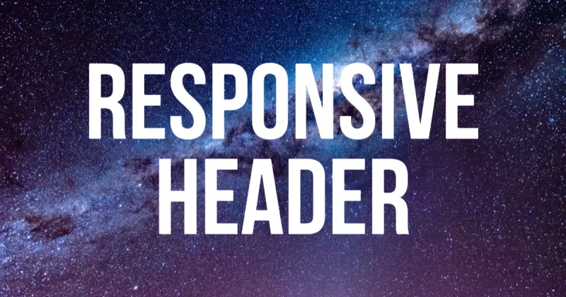
Say I want to create a header for my new website. I’m going to start with this high-resolution photo by Graham Holtshausen on Unsplash.

The first thing I’m going to do is shrink the image down so the width is 2560 pixels. Most screens won’t go higher than this so this is a good maximum.
Since this is a header image, I’m going to crop it so it’s short and wide. I’m cropping on center with the height at 100 pixels.

Note that the image may appear less than 2560 x 100 on this blog post so it fits on the page.
Finally, I’ll darken the center, add a logo, and add text in Photoshop to create the header.

Now I can create a page using this header at the top.
<!doctype html>
<html lang="en">
  <head>
    <meta charset="utf-8" />
    <meta
      name="viewport"
      content="width=device-width, initial-scale=1, shrink-to-fit=no"
    />

    <link rel="stylesheet" href="styles/normalize.css" />
    <link rel="stylesheet" href="styles/main.css" />

    <title>My Site</title>
  </head>
  <body>
    <img src="images/header.webp" />

    <div class="container">
      <!-- The contents of the page will go here. -->
    </div>
  </body>
</html>
Notice I’m using Normalize.css (to make browsers render all elements more consistently). And I’ve included another stylesheet. Right now the styles are pretty minimal.
html {
  font-size: 22px;
}

.container {
  width: 80%;
  margin: 0 auto;
}
The site looks like this.
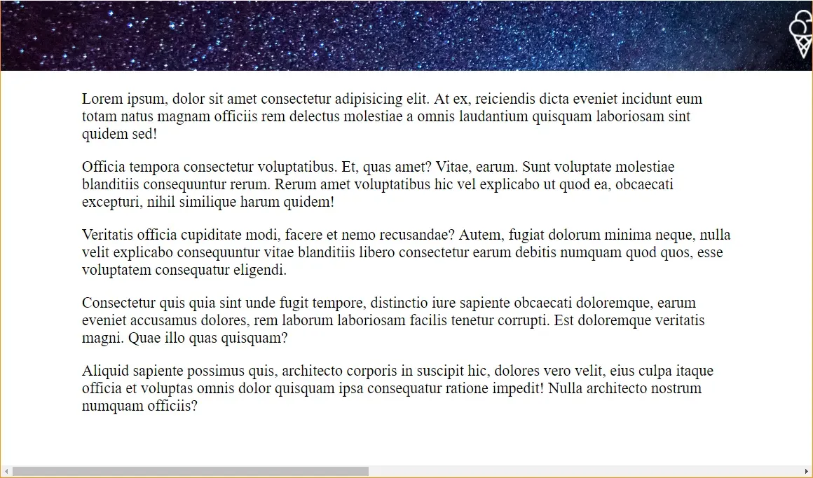
Oh no. The main part of the header isn’t visible. Plus, the huge width makes the site scroll horizontally. We can fix it with a little bit of HTML…
<header>
  <img src="images/header.webp" />
</header>
…and a little bit of CSS.
header {
  overflow: hidden;
}

header img {
  margin-left: 50%;
  transform: translateX(-50%);
}
With those changes in place, the header looks better!
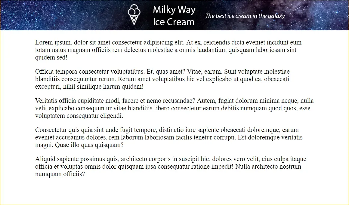
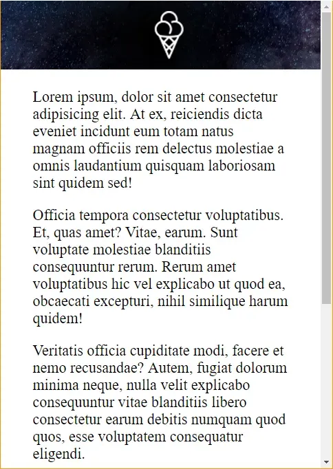
But look what happens on smaller screens.
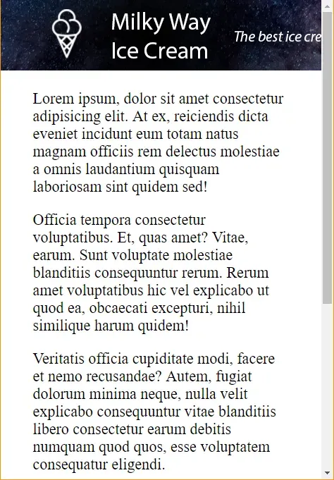
The header is cut off. On extra small devices like this (portrait phones) with a max width of 576 pixels, it might be nice to just show the ice cream logo. To do that, I create a smaller header image with only the logo. This image is 576 x 100 pixels.

To get this image to show on extra small devices, but the other image on
larger screens, we can use the <picture> and <source> elements.
I replace the <img> in the <header> with a <picture> element.
<header>
  <picture>
    <!-- Our sizes and image sources go here -->
  </picture>
</header>
Inside the <picture>, we’ll place a couple <sources>.
<header>
  <picture>
    <source media="(max-width: 576px)" srcset="images/header-576.webp" />
    <source media="(min-width: 577px)" srcset="images/header-2560.webp" />
  </picture>
</header>
You can see that header-576.webp will be displayed on screens up to 576
maximum width. The other image — header-2560.webp — will be shown on devices
577 pixels and up.
In addition to these two sources, I’ll also add the big original header as a
fallback in an <img> element.
<header>
<picture>
<source media="(max-width: 576px)" srcset="images/header-576.webp" />
<source media="(min-width: 577px)" srcset="images/header-2560.webp" />
<img src="images/header-2560.webp" />
</picture>
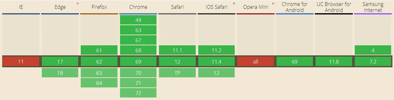
</header>I add this fallback because <picture> isn’t quite supported across the board.
Here’s the compatibility table at the time of this writing.
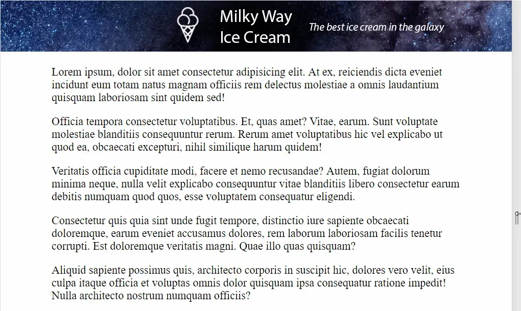
Now that we’ve made our header more responsive, here’s how it looks on extra small devices.
On larger devices it still looks good.
How about medium devices (up to 922 pixels)? Simple. It’s the same process.
Create a 922 x 100 pixel header.

And add the <source>.
<picture>
  <source media="(max-width: 576px)" srcset="images/header-576.webp" />
  <source media="(max-width: 922px)" srcset="images/header-922.webp" />
  <source media="(min-width: **923px**)" srcset="images/header-2560.webp" />
  <img src="images/header-2560.webp" />
</picture>
Note the additional change to the min-width of the largest <source>. It’s
always 1 pixel higher than the previous max-width.
The images are dynamic, too. If the user’s viewport changes, the image automatically changes.
Your needs will dictate which breakpoints you should include; In general, you might consider…
- 576px for extra small devices like portrait mode phones
- 768px for small devices like landscape phones
- 992px for medium devices like tablets
- 1200px for large devices like desktops
- 2560px for extra large devices like large desktops
These are the same breakpoints used by Bootstrap 4.
Finally, there is another benefit to using responsive images in this way: The
only image(s) that get downloaded are the ones that meets the breakpoint media
rules. This means that, on extra small devices, only header-576.webp gets
downloaded. In my case, it’s five times smaller than the original
header-2560.webp; A savings of 465 kilobytes!
See this CodePen pen for a live version of this project that you can play around with.