 Travis Horn
Data Types: Continuous, Discrete, and Related Categories
Recognizing data types is a foundational concept in statistics and data science because the type of data you have dictates the appropriate statistical methods, visualization, and analyses to use. This a quick guide to help you identify and differentiate between the main categories of data, explain their characteristics, recognize the appropriate analyses, understand distinctions, and avoid common mistakes when analyzing data.
Quantitative: Continuous
Continuous values are numeric; any value with an interval.
For example:
- Height (inches and centimeters)
- Weight (pounds and kilograms)
- Temperature (Fahrenheit and Celsius)
- Time (seconds and minutes)
- Blood pressure (mmHg - millimeters of mercury)
- Concentration (mol/L - moles of solute per liter of solution)
- Distance (miles and kilometers)
- Voltage (volts)
- Gross domestic product (GDP) per capita
- Reaction time (milliseconds)
Analysis on continuous values typically include t-test, ANOVA, linear regression, density plots, and histograms.
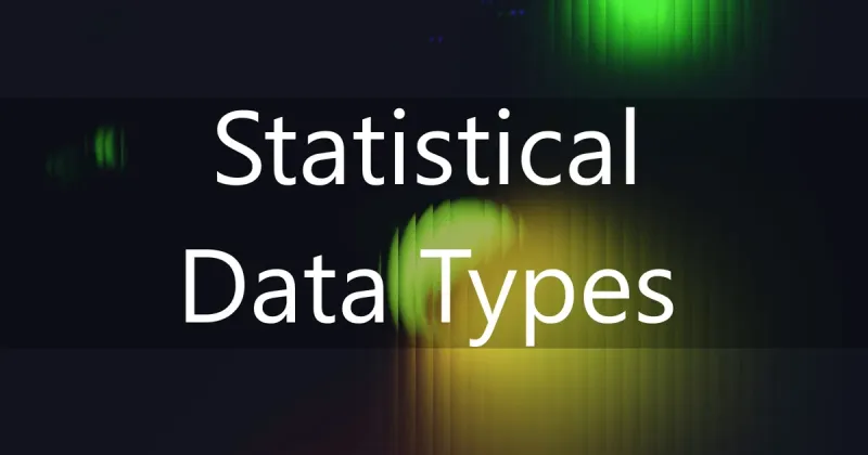
A bell curve plot showing the height of U.S. women. From Lumen Learning.
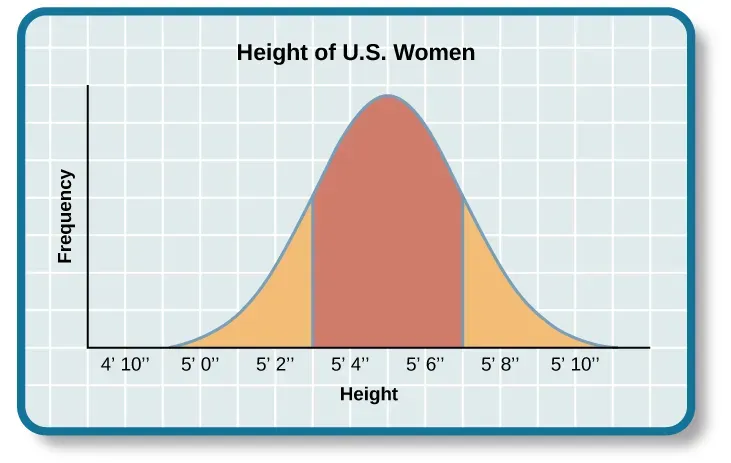
A histogram showing customer age groups. From Paul Turley’s SQL Server BI Blog.
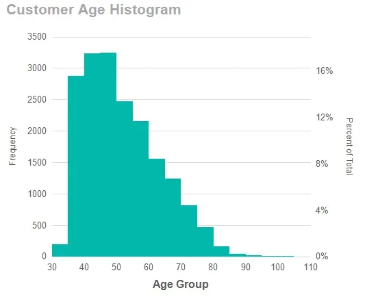
A scatter plot showing square footage vs price for homes. From Visme.
Think about measuring someone’s height. While height is continuous, your measuring tape has its limits. You might record 5’8”, but a more precise tool could reveal it’s actually 5’8.125”. The tools we use always put a limit on how precise our continuous data can be, and it’s something to keep in mind when you’re analyzing it.
Quantitative: Discrete
Discrete values are also numeric, but represent distinct separate values (usually integers).
For example:
- Number of children
- Defect count
- Number of visits
- Eggs laid
- Phone call counts
- Number of transactions
- Dice outcomes
- Goals scored
Discrete values are typically analyzed using Poisson/negative binomial regression, chi-square (counts), bar charts, and frequency tables.
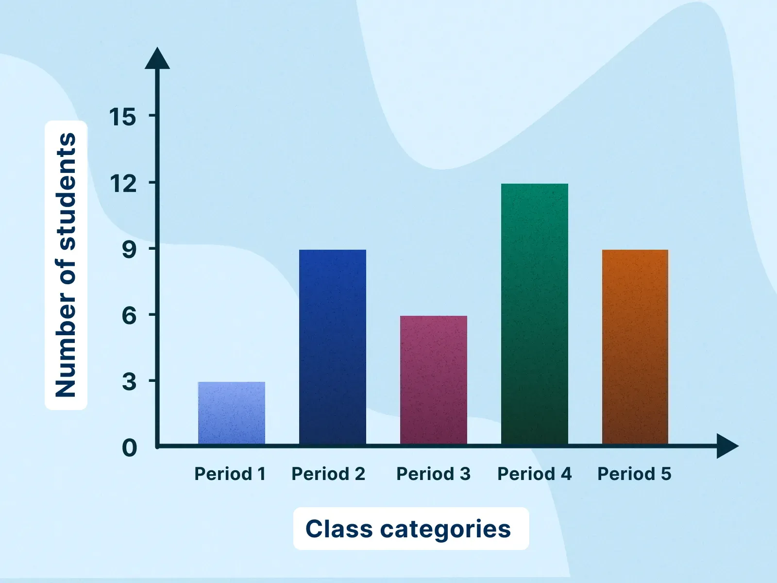
Bar chart showing number of students in various classes. From Animalia Life.
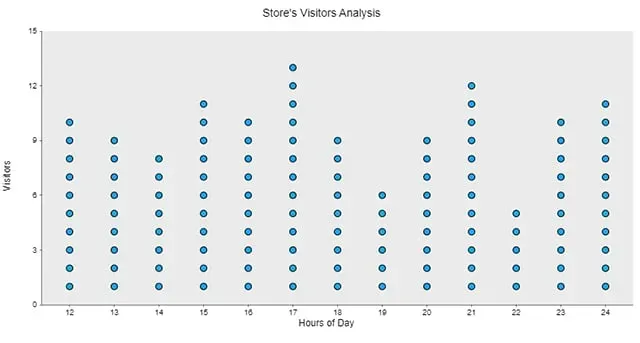
Dot plot showing visitors per hour of the day. From Anamalia Life.
Discrete values can further be broken down into small-range and count data. Think about the difference between the number on a dice roll and the number of views a YouTube video has? Both are discrete, but we think about them differently. A dice roll is small-range discrete data. it has a fixed, limited set of outcomes (1 through 6). Now, the number of views is count data. It could be 0, 10, or 10,000 (there’s no upper limit).
Categorical: Nominal and Ordinal
Nominal values are categories without order.
For example:
- Eye colors (brown, blue, and green)
- Blood types (A+, A-, B+, B-, AB+, AB-, O+, O-)
- Species (tigers, elephants, blue whales, oak trees, and sunflowers)
- Cities (Tokyo, Sao Paulo, Cairo, and New York City)
- Brands (Apple, Samsung, and Mercedes-Benz)
You can plot nominal values in a contingency table, chi-squares, and bar charts.
Ordinal values are ordered categories where the intervals are not equal.
For example:
- Likert scale (strongly disagree, disagree, neutral, agree, strongly agree)
- Education level (less than high school, high school graduate, some college, bachelor’s degree, master’s degree, doctorate)
- Customer satisfaction (dissatisfied, neutral, satisfied)
- Medal rank (bronze, silver, and gold)
Ordinal values are typically plotted using ordinal logistic regression, median/IQR, and stacked bar charts.
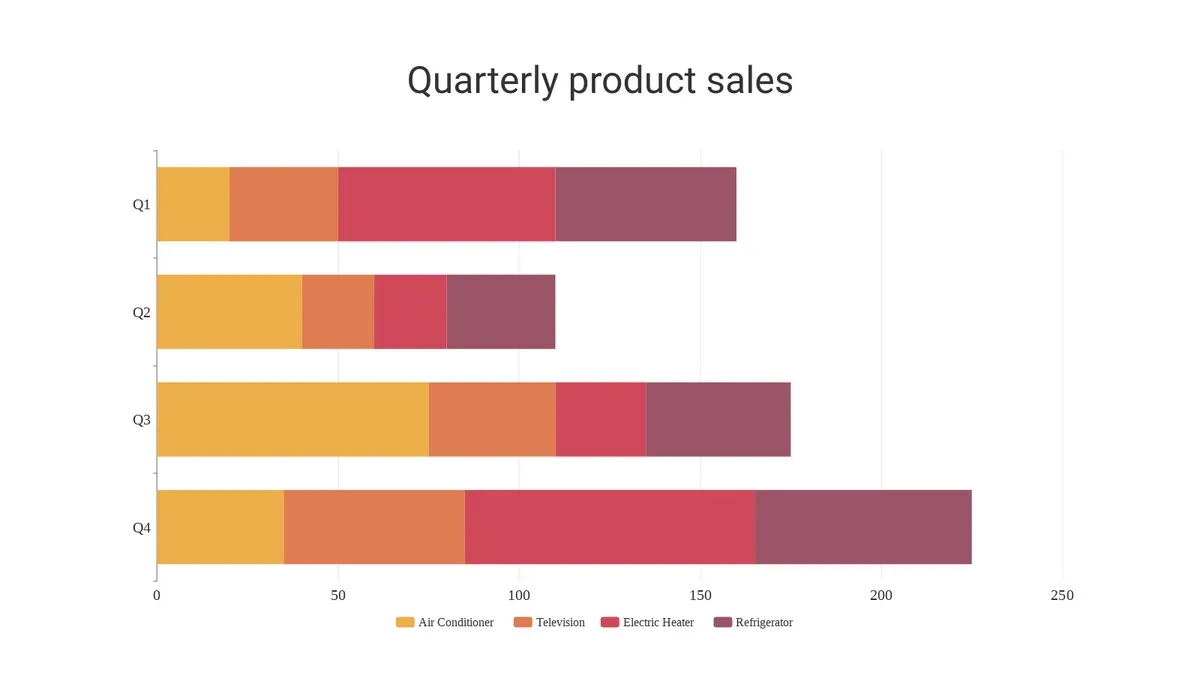
Stacked bar chart showing quarterly product sales. From Visual Paradigm Online.
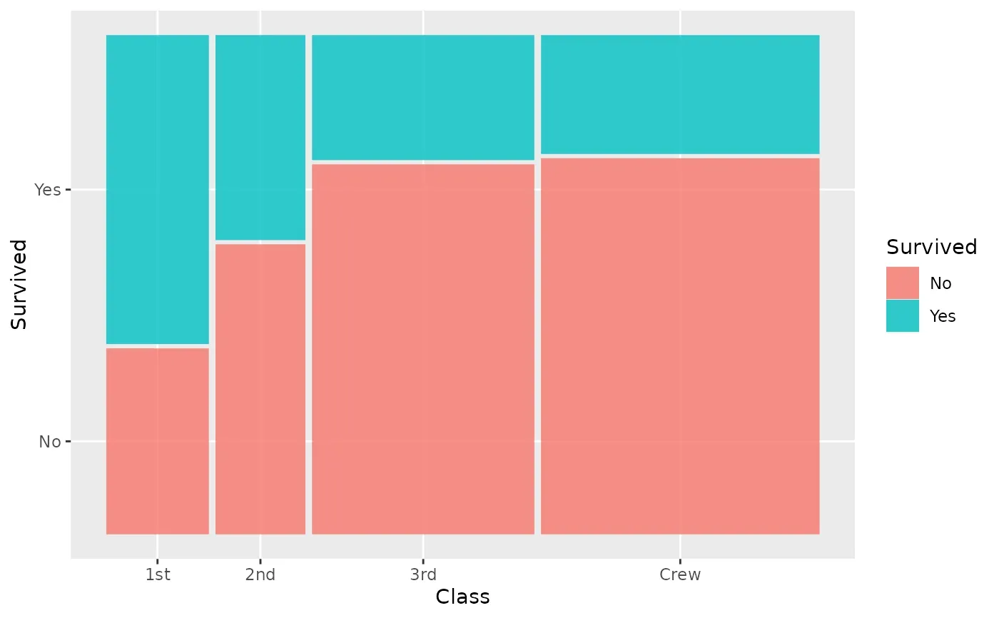
A mosaic plot showing survival per class. From ggmosaic.
Sometimes it can be tempting to treat ordinal values as numeric. Say you’ve got a survey with responses from “Very Dissatisfied” to “Very Satisfied”.” You could assign numbers from 1 to 5, but is the jump from “Very Dissatisfied” to “Dissatisfied” the same size as the jump from “Neutral” to “Satisfied?” Probably not.
It’s common to treat some ordinal data (like Likert scales) as numeric because it unlocks simpler analysis, but be aware you’re making a big assumption that the distance between each category is equal.
Binary and Dichotomous
Binary values appear when there are two possible values.
For example:
- Yes/No
- True/False
- Infected/Not Infected
- Pass/Fail
Analysis on binary values can be done using logistic regression, confusion matrices, ROC curves, and bar charts.
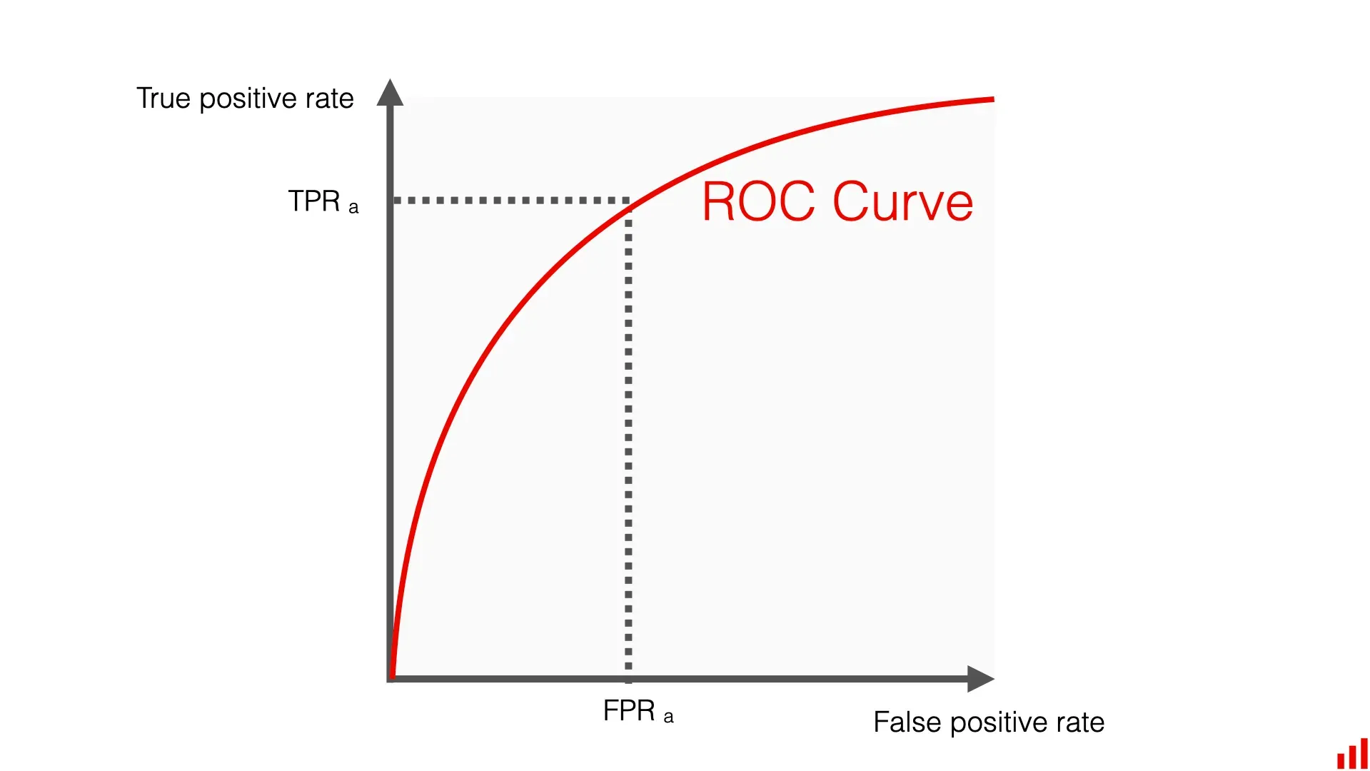
A ROC curve showing true positive rate vs false positive rate. From Evidently AI.
Scale-specific Numeric: Interval vs Ratio
Interval values have meaningful differences, with no true zero.
For example:
- Celsius (0, 37, 100)
- Fahrenheit (32, 98.6, 212)
- Calendar year (1492, 1776, 1945)
Note that an interval value can be zero (like 0 degrees Celsius), but that zero point is arbitrary; it is just a reference point, not a complete absence of the property being measured. 0 degrees Celsius doesn’t mean an absence of temperature.
Ratio values are similar, having meaningful differences, but they also include a true zero.
For example:
- Length (8 feet or 244 centimeters)
- Mass (102 grams or 3.6 ounces)
- Time elapsed (36 hours or 2160 minutes)
- Income ($9.50 or £7.22)
- Kelvin (0, 273.15, 373.15)
A length of 0 is a true zero; the absence of length. It doesn’t matter if you’re measuring in feet, centimeters, or anything else. It’s always zero.
With a true zero (ratio data), you can say things like “this is twice as long” or “that is half the price” because the starting point (zero) is absolute.
You can’t do this without a true zero (interval data). 20 degrees Celsius is not twice as hot as 10 degrees Celsius. This is also why percentage changes like “a 50% increase in income” only make sense for ratio data.
Count Data & Special Cases
Discrete non-negative integers are often modeled by Poisson-family distributions.
For example:
- Calls per hour
- Daily accident counts
- Species observed
These values are often analyzed with Poisson/negative binomial models and rate-based comparisons.
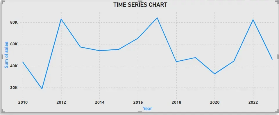
A time series chart showing sales over time. From GeeksforGeeks.
Mixed/Hybrid Data & Variable Treatment
Some datasets contain multiple types or variables that can be binned or treated differently.
For example, a survey might include:
- Age (continuous)
- Satisfaction (ordinal)
- Gender (nominal)
Whenever possible, you should analyze your data using its original, most detailed scale. Keeping a variable like age as a continuous number preserves far more information than collapsing it into categories, which ultimately gives your analysis more statistical power to detect relationships.
However, binning is useful when the general group is more important than the exact measurement. This can make complex data easier to interpret. For age, you might bin the data into bins of 18-24, 25-34, 35-44, and so on.
| Continuous | Binned | Ordinal |
|---|---|---|
| 28 years | 20-30 | Young Adult |
| 45.7 years | 40-50 | Middle-aged |
| 19.2 years | 10-20 | Teenager |
| 61 years | 60-70 | Senior |
Decision Flow for Classifying a Variable
- Is the variable numeric? If yes, it’s quantitative. If no, it’s categorical.
- If numeric, can it take any real value in a range? If yes, it’s continuous. If no (integers/counts), it’s discrete.
- If categorical, are categories ordered? If yes, it’s ordinal. If no, it’s nominal.
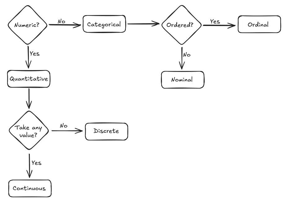
Example 1: Number of Siblings
Is it numeric? Yes, it’s a count. So it’s quantitative.
Can it take any value? No, you can’t have 1.5 siblings. It must be a whole number. So it’s discrete.
Example 2: T-shirt Size
Is it numeric? No. So it’s categorical.
Is there a clear order? Yes, “large” is bigger than “medium.” So it’s ordinal.
Statistical Test Quick Reference
For continuous vs continuous data, use correlation, linear regression, t-test, or ANOVA.
For continuous vs categorical data (with two groups), use t-test or Mann-Whitney (if nonparametric).
For categorical vs categorical data, use chi-square or Fisher’s exact.
For ordinal outcomes, use Poisson/negative binomial regression.
Avoiding Common Pitfalls
- Be cautious of arbitrarily binning continuous data.
- Check the distribution.
- Consider the measurement scale.
- Choose models that match the data type.
- Don’t treat ordinal data as interval without justification.
- Watch for zero-inflation in counts.
- Make sure you’re not misusing parametric tests on skewed continuous data.
Getting a handle on data types might seem like a small detail, but it’s the foundation for any solid analysis. Choosing the right chart, the right model, or the right statistical test all comes back to this first, crucial step. Get this step right, and you’re set up for telling an accurate data story.