 Travis Horn
Recreate the Google Loading Animation using only CSS
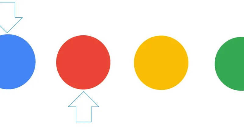
Google uses many different loading animations. The one we’ll be recreating today has four differently colored balls, bouncing in a horizontal line.
First we’ll need some <div>s to manipulate.
<div class="wrapper">
  <div class="blue ball">
    <div class="red ball">
      <div class="yellow ball">
        <div class="green ball"></div>
      </div>
    </div>
  </div>
</div>
That’s all the HTML that’s needed. Everything else is in CSS.
For the sake of example, I want the animation to appear centered on the page. I’ll use the flexible box model for this.
.wrapper {
  display: flex;
  justify-content: center;
  align-items: center;
  height: 200px;
}
There are a few common properties of all four balls.
.ball {
  width: 22px;
  height: 22px;
  border-radius: 11px;
  margin: 0 10px;
}
The equal width and height makes them squares, and the border-radius
rounds the corners all the way until they appear round. The margin spaces them
apart from one-another.
Each of the balls will have a different color. Here they are:
.blue {
  background-color: #4285f5;
}
.red {
  background-color: #ea4436;
}
.yellow {
  background-color: #fbbd06;
}
.green {
  background-color: #34a952;
}
We want all the balls to bounce, so we’ll define the keyframes (or keyframe, actually) for an animation called “bounce”.
@keyframes bounce {
  50% {
    transform: translateY(25px);
  }
}
This single keyframe states that the ball should be translated (moved) 25 pixels down on the Y (vertical) axis 50% through the animation. Because there are no other keyframes, it can be inferred that each ball will be sitting at it’s original position at 0% at 100% through the animation. This gives the bouncing effect.
Let’s apply the animation to the all four balls.
.ball {
  width: 22px;
  height: 22px;
  border-radius: 11px;
  margin: 0 10px;

  /* Add this line */
  animation: 2s bounce ease infinite;
}
The balls will bounce every 2 seconds indefinitely. They will be eased in and out.
There’s one problem: all four balls bounce at the same time. We can fix this by applying a different animation-delay on each one.
.red {
  background-color: #ea4436;
  animation-delay: 0.25s;
}

.yellow {
  background-color: #fbbd06;
  animation-delay: 0.5s;
}

.green {
  background-color: #34a952;
  animation-delay: 0.75s;
}
Why is .blue missing in the code above? Because we don’t want to delay that
ball. It should start bouncing immediately.
That’s it. The complete code looks like this:
<div class="wrapper">
  <div class="blue ball"></div>
  <div class="red ball"></div>
  <div class="yellow ball"></div>
  <div class="green ball"></div>
</div>

<style>
  .wrapper {
    display: flex;
    justify-content: center;
    align-items: center;
    height: 200px;
  }

  .ball {
    width: 22px;
    height: 22px;
    border-radius: 11px;
    margin: 0 10px;

    animation: 2s bounce ease infinite;
  }

  .blue {
    background-color: #4285f5;
  }

  .red {
    background-color: #ea4436;
    animation-delay: 0.25s;
  }

  .yellow {
    background-color: #fbbd06;
    animation-delay: 0.5s;
  }

  .green {
    background-color: #34a952;
    animation-delay: 0.75s;
  }

  @keyframes bounce {
    50% {
      transform: translateY(25px);
    }
  }
</style>