 Travis Horn
Responsive grid in 2 minutes with CSS Grid Layout

Are you trying to build a grid of elements? If so, you’ve probably noticed one size doesn’t fit every screen size. The modern solution is a responsive grid that changes based on the size of the screen viewing it. Many developers jump to a web design framework for their responsive grid needs. But it might not be as hard as you think to code your own.
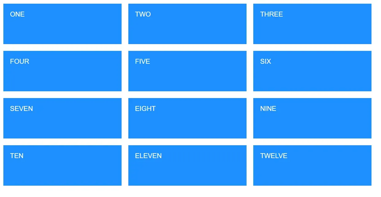
In a few lines of code, you can create something like this:
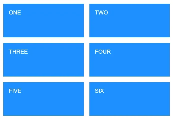
Let’s start with 12 “cards”.
<div class="card">ONE</div>
<div class="card">TWO</div>
<div class="card">THREE</div>
<div class="card">FOUR</div>
<div class="card">FIVE</div>
<div class="card">SIX</div>
<div class="card">SEVEN</div>
<div class="card">EIGHT</div>
<div class="card">NINE</div>
<div class="card">TEN</div>
<div class="card">ELEVEN</div>
<div class="card">TWELVE</div>
Add some basic styles.
html {
  font-size: 22px;
}
body {
  padding: 1rem;
}

.card {
  background-color: dodgerblue;
  color: white;
  padding: 1rem;
  height: 4rem;
}
I cropped the rest out, but you get the idea.
Add a parent element to contain the cards.
<div class="cards">
<div class="card">ONE</div>
<div class="card">TWO</div>
<div class="card">THREE</div>
<div class="card">FOUR</div>
<div class="card">FIVE</div>
<div class="card">SIX</div>
<div class="card">SEVEN</div>
<div class="card">EIGHT</div>
<div class="card">NINE</div>
<div class="card">TEN</div>
<div class="card">ELEVEN</div>
<div class="card">TWELVE</div>
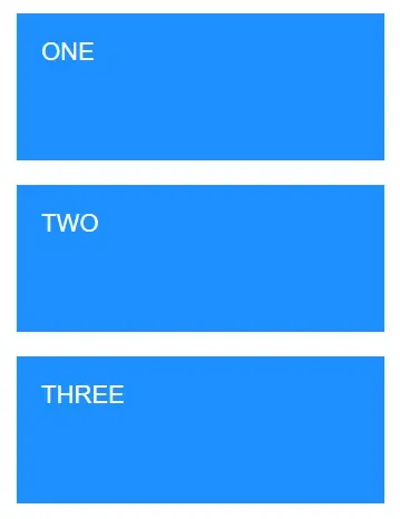
</div>Add a width, margin, and some CSS Grid Layout styles to the parent. The only change you’ll notice so far is the gap between elements.
.cards {
  max-width: 1200px;
  margin: 0 auto;
  display: grid;
  gap: 1rem;
}
And so on.
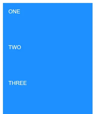
We’re coding for mobile first so we assume the user is using a small screen. That’s why the cards take up a whole row each (one column).
Now let’s make the cards responsive for larger screen sizes.
Is the screen larger than 600 pixels? Make it two columns.
@media (min-width: 600px) {
  .cards {
    grid-template-columns: repeat(2, 1fr);
  }
}
Is the screen larger than 900 pixels? Make it three columns.
@media (min-width: 900px) {
  .cards {
    grid-template-columns: repeat(3, 1fr);
  }
}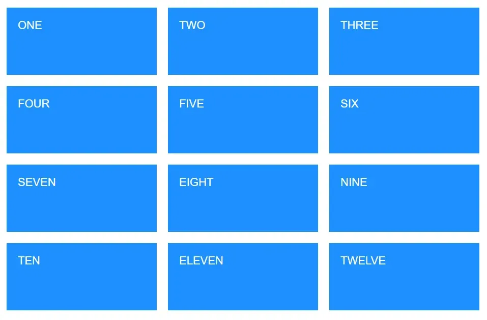
And it transforms as the screen size changes! The 3x4 grid will become a 2x6 grid or a 1x12 grid as the viewport gets smaller.
As you may have noticed, once the parent has display: grid, all the magic
comes from adjusting grid-template-columns: repeat(NUM_COLUMNS, 1fr) for
different media breakpoints (@media (min-width: SOME_WIDTH){}).
See a demonstration on CodePen.
Bonus! Eliminating media queries with minmax()
In some cases, you may be able to avoid writing media queries by using
minmax(). To see it
in action, remove the media queries and add the following line to the .cards
selector.
grid-template-columns: repeat(auto-fit, minmax(300px, 1fr));The columns will automatically break when each one gets below 300px.
See a demonstration of the automatic breakpoints on CodePen.