 Travis Horn
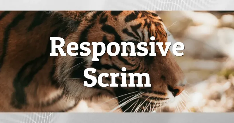
Responsive Scrim
Overlaying text on an image, or even a solid color, can get tricky. The text can very easily become too difficult to read. Scrim is one technique used for applying text over any color or image.
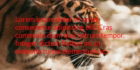
The problem, illustrated
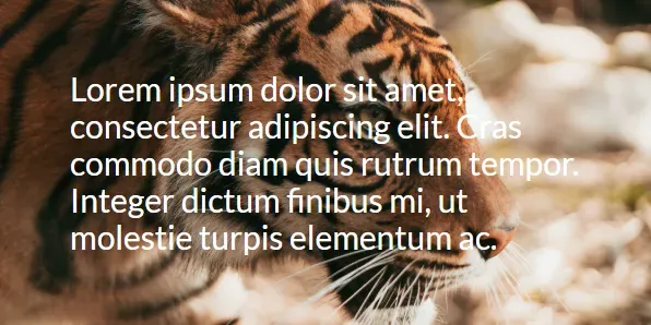
The text on the image above is hard to read. Especially over the light areas of the photo.
So just darken the text!
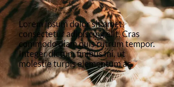
Uhh, no. That’s even worse. The font shows up great on the light parts of the photo, but not on the dark parts.
A color in the middle
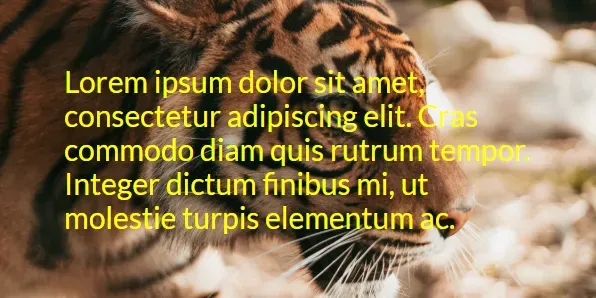 Yellow?
 Red?
Red?
No color seems to work here. And even if we found one, that color wouldn’t work for all images. So if you were trying to build a site that displays captions over thumbnails automatically, your only option would be to manually choose a color for each new thumbnail. Not to mention this eliminates nice, consistent design colors.
Another approach: solid text background
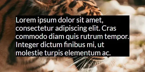
This actually works. The image is still there, and the text is readable. However, the text covers a huge portion of the photo. If the photo is important, this is a problem.
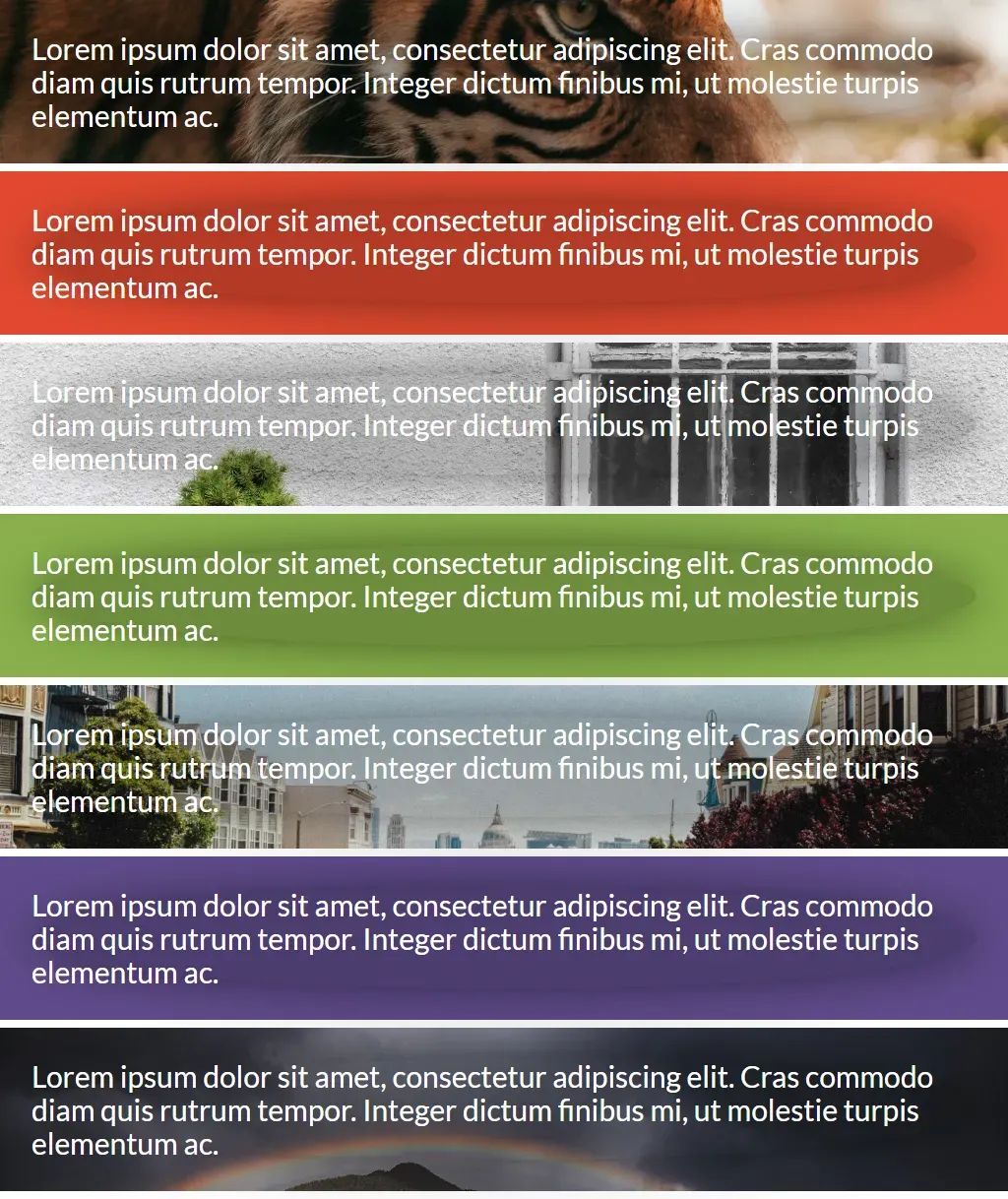
Crude scrim
Scrim is using any device to reduce intensity and/or harshness of light.
The black background color *really *reduces the intensity of light from the photo. It makes it non-existent. What about making that background half-transparent?
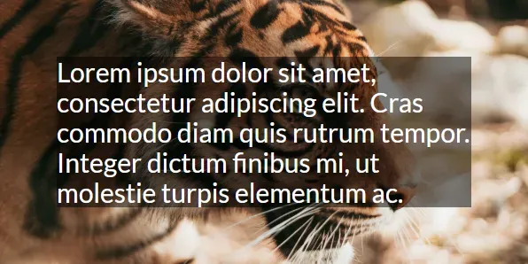
This looks good and many web designers might stop here. But we can do better.
Problem solved
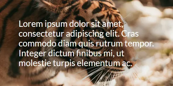
This looks similar to our original image, except the text is somehow readable! What we did here is turn the blocky dark text background into an oval, reduced the opacity even further, and added a deep blur around it (blur of the dark text background, not the photo).
And this works for almost any photo and color.
So how do I use it?
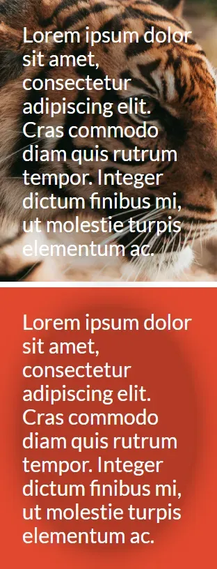
Say we have a panel that uses the tiger photo as its background, and white text in the foreground.
<div class="panel panel-tiger">Lorem ipsum dolor sit amet.</div>.panel {
background-position: center;
background-size: cover;
color: white;
}
.panel-tiger {
background-image: url(tiger.jpg);
}The first step is to place the text inside an inner <div>.
<div class="panel panel-tiger">
  <div class="scrim">Lorem ipsum dolor sit amet.</div>
</div>
Now we can apply the scrim styles to this inner element.
.scrim {
  border-radius: 50%;
  background-color: rgba(0, 0, 0, 0.2);
  box-shadow: 0 0 5rem rgba(0, 0, 0.5);
}
Setting that border-radius rounds the corners to much that the background
forms an oval (or circle, if the panel is square).
Setting that background-color makes the background completely black, but only
20% opaque.
Finally, the box-shadow creates a deep blur around the edges so the scrim
appears as a gradient.
Responsiveness
The best part of all? Coding it this way makes it look good no matter if the screen and/or photo is large or small, wide or narrow.
See it in action
Take a look at this CodePen for live examples.
Cover photo by Matthew Kane.