Travis Horn
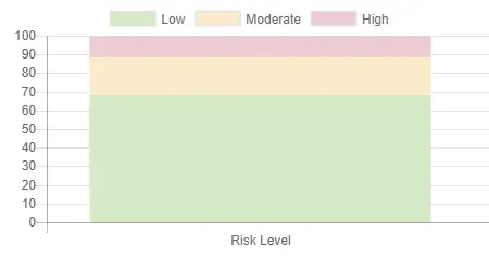
Stacked Bar Chart with Chart.js

This is a simple example of using Chart.js to create a stacked bar chart (sometimes called a stacked column chart).
Chart.js provides simple yet flexible JavaScript charting for designers & developers.
It allows you to create all types of bar, line, area, and other charts in HTML. It uses the canvas standard. While I do prefer using SVG when working with data visualization on the web, Chart.js is a popular option, so it’s worth checking out.
Starting with a basic index.html:
<!DOCTYPE html>
<html lang="en">
  <head>
    <meta charset="utf-8" />
    <meta
      name="viewport"
      content="width=device-width, initial-scale=1, shrink-to-fit=no"
    />
    <title>My Stacked Bar Chart</title>
  </head>
  <body></body>
</html>
In the body, we’ll need a <canvas> element to bind to. This is where the
chart will appear.
<canvas id="chart"></canvas>And we’ll pull in the Chart.js library.
<script src="https://cdnjs.cloudflare.com/ajax/libs/Chart.js/2.3.0/Chart.min.js"></script>The rest of the chart will be coded with JavaScript. So another <script>
tag is necessary.
<script>
  // Chart code will go here.
</script>
We’ll first need a reference to the <canvas> element we wrote earlier.
var ctx = document.getElementById("chart");And we’ll instantiate a new chart on this element. The first argument is the bound element, and the second is a definition of our chart. The definition will have three properties: type, data, and options.
var myChart = new Chart(ctx, {
  type: "bar",
  data: {},
  options: {},
});
Notice we’ve told Chart.js that this will be a bar type chart.
In the data property, we’ll define datasets and their labels. In my example, I
have three datasets — all with the same label.
data: {
  labels: ['Risk Level'],
  datasets: [
    { /* dataset one */ },
    { /* dataset two */ },
    { /* dataset three */ }
  ]
}
Each dataset will have a label, data array, and backgroundColor. In a stacked bar chart, each dataset will have only one point of data.
datasets: [
  {
    label: "Low",
    data: [67.8],
    backgroundColor: "#D6E9C6", // green
  },
  {
    label: "Moderate",
    data: [20.7],
    backgroundColor: "#FAEBCC", // yellow
  },
  {
    label: "High",
    data: [11.4],
    backgroundColor: "#EBCCD1", // red
  },
];
We’ve told Chart.js that we want a bar chart, we’ve told it about our data, the
last step is to tell it that this is chart should be stacked. We do this in the
options property.
options: {
  scales: {
    xAxes: [{ stacked: true }],
    yAxes: [{ stacked: true }]
  }
}
The end result is a stacked bar chart.