 Travis Horn
Using JavaScript to Work with Spreadsheets, Part 1: The Shape of the Data

This is the first article in a series where we’ll be learning to use the powerful logic of a programming language like JavaScript to manipulate spreadsheet data.
In this article, we’ll talk about how the source data should be shaped. We won’t really go into any big programming techniques, but will get our data into the right format for working with it programmatically.
The term “spreadsheet” is pretty generic. It could mean tabular data written down using paper and pencil, a file created in Apple Numbers, comma-separated values (CSV), a file saved in XLSX format by Microsoft Excel, or a Google Sheets document just to name a few.
Let’s take a look at an XLSX file. This is the format used by Microsoft Excel.
Excel is a powerful program that isn’t strict on how users can lay out their spreadsheets. Many times, users will focus on the visual aspect rather than making sure the data is structured consistently.
For example, a common Excel file may look something like this:
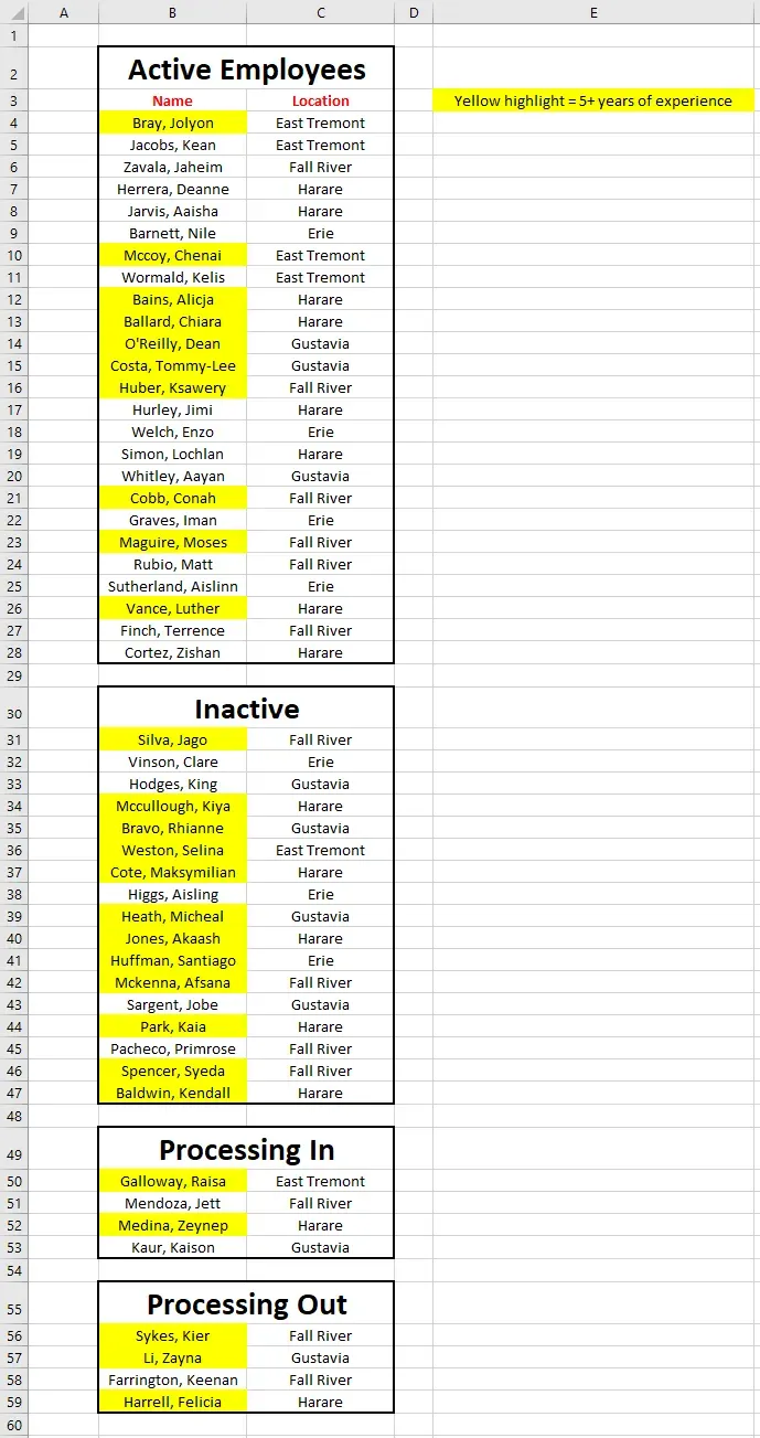
The person who created this spreadsheet put a focus on the presentation and less regard for data consistency. It may look prettier to some, but there are some flaws to this method.
First of all, rows and columns are being used for spacing here. The first column is simply blank. Likewise for the rows between groupings. When presenting data, this is fine. But when attempting to work on data like this programmatically, this produces a lot of issues.
Second, employees are grouped into various statuses like “Active” and “Inactive.” Ideally, you’d want any data to be in a tabular format. Why is the name and location laid out in a tabular way, but the status is coded as headings above various groups?
Similarly, some data is coded with colors. This is a common technique novice spreadsheet users use. In this example, we are lucky enough to get a legend (notice to “Yellow highlight = 5+ years of experience” cell). Many time there is no legend and the colors only make sense to the person who created the spreadsheet. Again, the ideal situation is to have all data in a tabular format. Try to avoid encoding data through headings or colors.
Next is the issue of the headers themselves. They only appear on row 3 at the top of the “Active” status group. When working with spreadsheet data, there is an extremely strong convention to simply but the headers on row 1 by themselves.
Before we can work with this spreadsheet, we must first correct these issues. A much better spreadsheet would look like this:
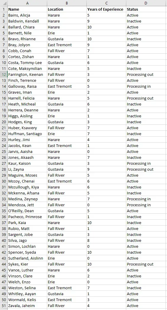
In this format, the data always appears as you would expect it. Rows and columns are laid out logically. The name is always in column A, the location in column B, etc. There is always one row per person. With data in this format, things become much easier to work with.
I recommend keeping a spreadsheet using these techniques. If you need to present the data, you can always save a copy and modify it to look prettier with colors and various groupings, fonts, etc. But the source data should always been in a consistent, predictable format.
In addition to the data shown above, this series will be using an Excel file with an additional sheet. That sheet looks like this:
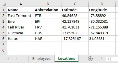
Notice the two sheets “Employees” and “Locations.” These two sheets contain all the data we’ll use for this series.
In the next article, we’ll go over how to install the tools needed to work with this data in JavaScript. This will include Node.js and Visual Studio Code.