 Travis Horn
When to Use Flexbox Over CSS Grid
Both Flexbox and CSS Grid are powerful layout tools built into modern CSS. They are often discussed as if you must pick one or the other, but in practice they complement each other well. Understanding the strengths of each will help you understand which to use for different scenarios, and even when you might want to use both at the same time.
The Purpose of Each
Flexbox was designed for one-dimensional layout. It handles elements in a single direction at a time (either row or column). It takes a sequence of items, (horizontal or vertical), and distributes them dynamically along that single axis.
CSS Grid, on the other hand, was built for a two-dimensional layout. It controls both rows and columns. With Grid, you define a framework of tracks, giving you the power to align elements horizontally and vertically at the same time.
When to Use Flexbox
If your layout flows strictly in one direction, Flexbox is the way to go.
Flexbox lets items shrink or grow based on their actual content. It distributes spacing dynamically, even when handling an unknown number of items.
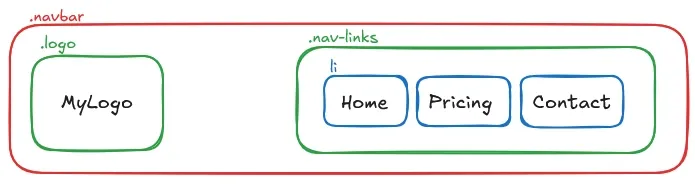
It’s great for small, reusable components. Elements like cards, tags, and form controls rely on it to handle their internal layout.
<nav class="navbar">
  <div class="logo">MyLogo</div>
  <ul class="nav-links">
    <li>Home</li>
    <li>Pricing</li>
    <li>Contact</li>
  </ul>
</nav>
.navbar {
display: flex;
justify-content: space-between;
align-items: center;
}
.nav-links {
display: flex;
gap: 20px;
list-style: none;
}
When to Use CSS Grid
CSS Grid is the best choice for two-dimensional layouts. You can use it for building page-level shells. Think mapping out headers, sidebars, and footers across both rows and columns.
Grid is perfect when you need container-driven sizing. It keeps column widths and row heights consistent, ensuring elements line up regardless of the size of their content.
Grid also has a powerful placement model. You can do things like intentionally overlapping elements by assigning them to the same grid cells, and more.
<div class="page-skeleton">
  <header>Header</header>
  <aside>Sidebar</aside>
  <main>Main Content</main>
  <footer>Footer</footer>
</div>
.page-skeleton {
display: grid;
grid-template-columns: 250px 1fr;
grid-template-areas:
"header header"
"sidebar main"
"footer footer";
gap: 20px;
}
header { grid-area: header; }
aside { grid-area: sidebar; }
main { grid-area: main; }
footer { grid-area: footer; }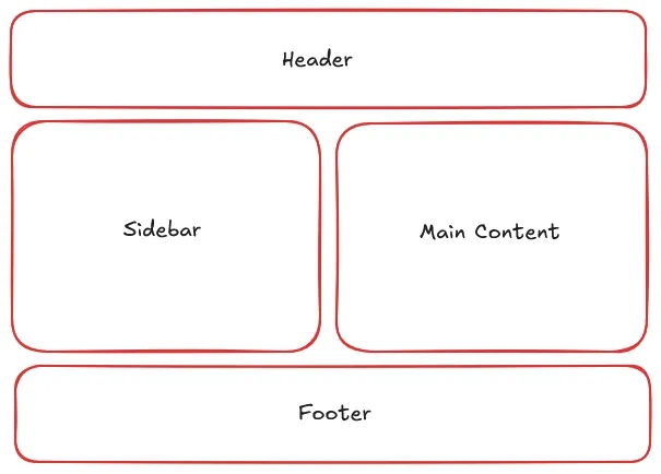
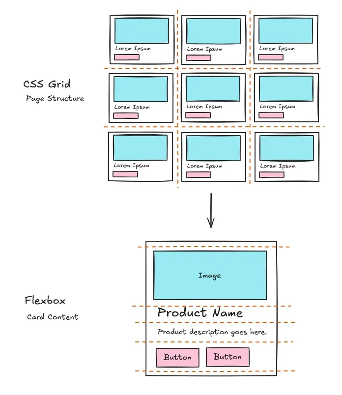
When to Use Both
You don’t have to choose between them. A common pattern is using Grid for the macro layout and Flexbox for the micro layout. Grid builds the overall page structure, and Flexbox sits inside the grid cells to format the individual components.
Think about a product gallery, for example. Grid handles the two-dimensional tiling of the cards across the page. Inside each card, Flexbox takes over to vertically distribute the image, text, and buttons.
<section class="product-gallery">

  <article class="product-card">
    <img src="product.jpg" alt="Product Image">
    <h3>Product Name</h3>
    <p>Product description goes here.</p>
    <div class="buttons">
      <button>Button</button>
      <button>Button</button>
    </div>
  </article>

  <!-- Imagine 8 more cards here to make the 3x3 grid -->

</section>
/* CSS Grid: Page Structure */
.product-gallery {
  display: grid;
  grid-template-columns: repeat(3, 1fr);
  gap: 30px;
}

/* Flexbox: Card Content */
.product-card {
  display: flex;
  flex-direction: column;
  gap: 15px;
}

.product-card .buttons {
  margin-top: auto;
}
Quick Decision Checklist
-
One direction or two? If you only need to control layout in one direction, use Flexbox. If you need both rows and columns, use Grid.
-
Content or container? If sizing is driven by the content shrinking and growing, use Flexbox. If it is driven by the container, use Grid.
-
Component or skeleton? If you are building a small component, use Flexbox. If you are mapping out a page skeleton, use Grid.
Neither tool is better than the other. They solve different problems. Flexbox excels at one-dimensional, content-driven layouts, while Grid excels at two-dimensional, container-driven layouts. You can and should use both, in the right application, for more maintainable CSS.
Cover photo by Pawel Czerwinski on Unsplash.