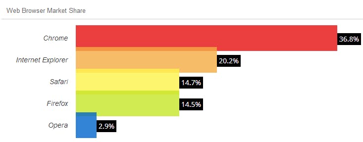
Every browser renders pages and behaves differently. Even the ones that try to stick to standards implement them inconsistently. Make sure your site is usable for your target audience. If you are developing for the general public, the audience may be using any browser they choose. At a minimum test against…

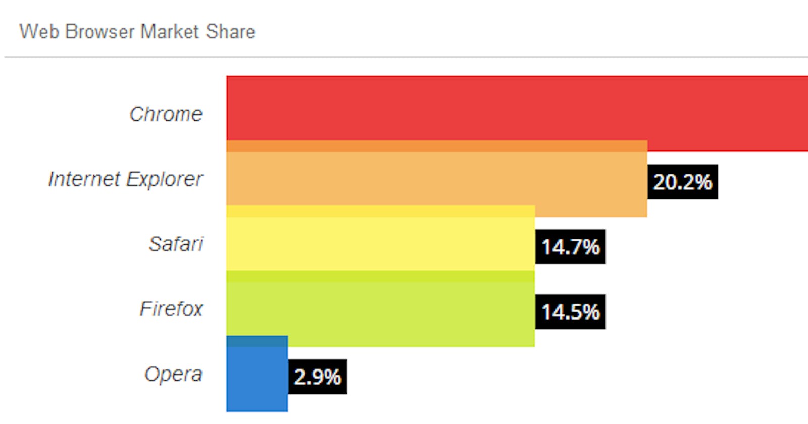
Web Browser Market Share for July 2014 from W3Counter
Also consider how browsers render your site in different operating systems. The major ones being…
Linux (such as Ubuntu)
and mobile platforms such as…
A good starting point is using a normalizing stylesheet.
Consider using a reset stylesheet or normalize.css.
The goal of a reset stylesheet is to reduce browser inconsistencies in things like default line heights, margins and font sizes of headings, and so on. … Reset styles quite often appear in CSS frameworks, and the original “meyerweb reset” found its way into Blueprint, among others.
and
Normalize.css makes browsers render all elements more consistently and in line with modern standards. It precisely targets only the styles that need normalizing.
Keep in mind that you should always be catering to your users. If you are developing an internal-only site for an organization that requires its employees to use Internet Explorer, make sure the site works in Internet Explorer first.
For example, take a look at the following code.
<style>
  .intro {
    width: 100px;
    text-align: center;
    border: 1px solid #000;
    border-radius: 10px;
  }
</style>

<div class="intro">
  I love cats.
</div>
This will correctly show rounded corners in Chrome and Firefox, but squared corners in Internet Explorer 8 and older. This is a fairly harmless example, but worse inconsistencies can completely break a site.
Check out “Can I use” for up-to-date information on browser feature support.
“Can I use” provides up-to-date browser support tables for support of front-end web technologies on desktop and mobile web browsers.
Lately, there have been a number of all-in-one HTML, CSS, and JS frameworks; the most popular of which is Twitter’s Bootstrap. Including Bootstrap in your project will make sure your site displays consistently across the most popular browsers and devices.
Best of all, it’s easy to set up. Just include the CSS & JavaScript, and code your site according to its’ structure and classes.
Originally published on my old blog on August 23, 2014.

