


I love using D3.js for data visualization. However, there are some smaller projects where I’ve found manipulating SVG elements in Vue.js is sufficient. This approach is very appealing when you’re already using Vue. It’s nice because all of your data is already readily accessible, and you don’t have to load up another library and pass the data to it.

We can easily build a simple graphic like the one below using the Vue + SVG technique.
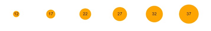 Circles sized according to the data they represent
For this example, you can just include Vue with a <script> tag and write the JavaScript directly in another <script> tag. Here’s the boilerplate:
<!DOCTYPE html>
<html lang="en">
  <head>
    <meta charset="utf-8">
    <meta name="viewport" content="width=device-width, initial-scale=1, shrink-to-fit=no">

    <title>Vue + SVG</title>

    <style>
      #app {
        width: 800px;
        margin: 5vh auto;
      }
    </style>
  </head>
  <body>
    <div id="app">
      <!-- App template goes here -->
    </div>

    <script src="https://unpkg.com/vue"></script>

    <script>
      new Vue({
        el: '#app',
        data: {
          data: [12, 17, 22, 27, 32, 37],
        },
      });
    </script>
  </body>
</html>
Notice, in the Vue app, I’ve already added the data we want to visualize. In the real world, you might be pulling this information via AJAX or it might be stored in a Vuex store. But hard-coding will do for this demonstration.
Let’s start by adding an <svg> element to our app’s template.
<div id="app">
  <svg width="800" height="100">
    <!-- To do: Add circles and text labels here -->
  </svg>
</div>
We want to add a circle for each piece of data.
<svg ..snip..>
  <circle
    v-for="(d, i) in data"
  />
</svg>
The circles are now inside the SVG element, but they are not displayed anywhere because they have no position or size.
Let’s start with the Y axis. We want them centered vertically. So the cy attribute for all circles will be half the chart’s height. One way to do this might be to look at the height (100), divide in by 2 in your head (50), then set cy="50". But a better option would be to use a computed variable in Vue.
First, change the height attribute on the <svg> element to be bound to a Vue variable.
<svg width="800" :height="chartHeight">
Then, add the variable to the data property in Vue.
new Vue({
  el: '#app',
  data: {
    data: [12, 17, 22, 27, 32, 37],
    **chartHeight: 100,**
  },
});
Now add a computed property called y:
new Vue({
  el: '#app',
  data: {
    data: [12, 17, 22, 27, 32, 37],
    chartHeight: 100,
  },
  **computed: {
    y() { return this.chartHeight / 2; },
  },**
});
Finally, we can bind our computed property y to the cy attribute of the circles.
<circle
  v-for="(d, i) in data"
  **:cy="y"**
/>
The code above means that all circles will have a cy that is equal to chartHeight / 2. Even if you change the chart’s height, the circles will still remain vertically centered.
With the Y axis done, let’s move on tho the X axis. It’s a little trickier. This one will require a method that acts on the i variable (the index of the data — where it is positioned in the array).
<circle
  v-for="(d, i) in data"
  :cy="y"
  **:cx="x(i)"**
/>
Here’s what the method looks like:
new Vue({
  el: '#app',
  data: {
    data: [12, 17, 22, 27, 32, 37],
    chartHeight: 100,
  },
  computed: {
    y() { return this.chartHeight / 2; },
  },
  **methods: {
    x(i) { return i * 130 + 50; },
  },**
});
Basically, we multiply the index by 130.
The first piece of data will be positioned at 0 * 130 = 0
The next piece will be positioned at 1 * 130 = 130
The next piece will be positioned at 2 * 130 = 260
and so on…
If you use a lower number than 130, the circles will be closer together. If you use a higher number, they will be further apart.
We also add 50 to shift all of the circles to the right a little bit. This provides some padding on the left side of the chart.
The last attribute on the <circle>s will be r. This determines the size of the circle. We want the circles size to be dependent on the actual data ( d).
<circle
  v-for="(d, i) in data"
  :cy="y"
  :cx="x(i)"
**  :r="d"**
/>
In this case, we just bind it directly. But you could also use another method to to perform some sort of operation on it (like doubling it for example).
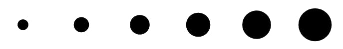
At this point, your page should show 6 black circles in increasing size.
You can change the color of the circles in CSS.
circle { fill: orange; }
Adding data labels is easy now that we have the basic process down. We use the <text> element with the same v-for andy& x computed properties. The inner content of this element is the data itself.
<text
  v-for="(d, i) in data"
  :y="y"
  :x="x(i)"
>{{ d }}</text>
The result is a simple data visualization using circles.
Those are the basic building blocks. With this knowledge you could code other features such as axis labels or bars ( <rect>s).
It’s worth mentioning again that while the possibilities are the same as using D3, D3 is an actual data visualization framework and is far and away the better tool to use for heavy dataviz. But if you’re already using Vue, and your data is already loaded there, it may be an easy and quick option.